Subscribe to get the latest product updates
Dashboard Tabs
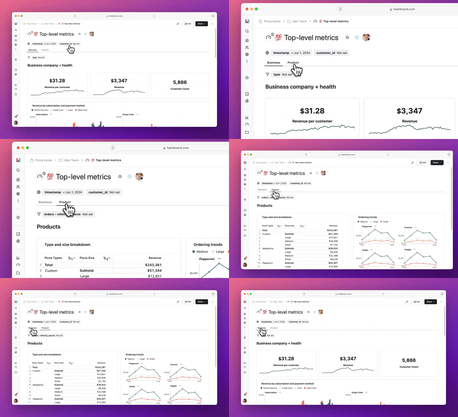
We’re excited to introduce Dashboard Tabs, a powerful new way to efficiently organize and navigate dashboards. This update allows you to:
- Create tabs for related groupings in a dashboard.
- Easily switch between sections.
- Improve navigation for complex analytics setups.
This feature helps streamline your dashboard experience, making it easier to manage large data sets and visualizations in one place.
Start organizing your dashboards with tabs today!
Custom Number Formatting
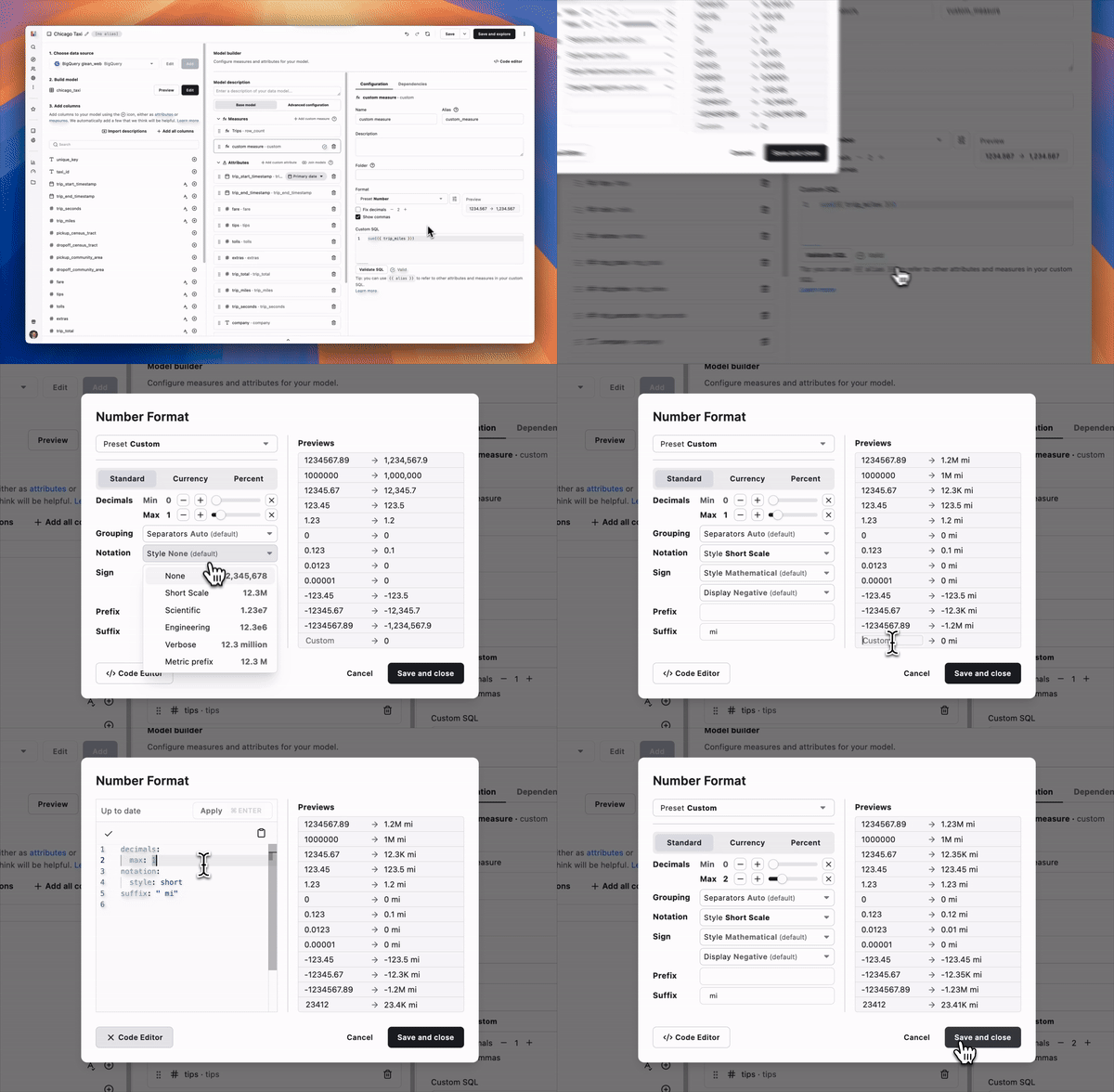
Transform your analysis by customizing formats on all numeric resources. Our new Number Format configuration provides greater flexibility and precision when dealing with complex numeric data types including:
- Apply specific notations for large and small numbers (e.g. “1.23K” or “$12.1M”)
- Select between mathematical signs (+/-) or accounting styles (parentheses)
- Integrate custom text to align with your business lexicon
- Adjust currency displays with a variety of global options and styles
- And much more...
Get started today by editing your data models, exploration adhocs, or exploration calculations.
Safeguard Changes with Staging-Only Builds and Build Archiving
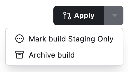
Staging-only builds, available now via the CLI and UI, protect against unintentionally pushing experimental changes to production environments. Use hb build --staging-only or convert an existing staged build from the dropdown menu. Additionally, you can now archive builds to declutter your Builds page — archived builds remain hidden by default while remaining accessible for record keeping.
Seamless Integration with CI: Build Directly from dbt Cloud Runs
Simplify your CI workflows with an enhanced Hashboard CLI integration for dbt Cloud. You can now trigger automated builds directly from a dbt Cloud CI run ID using hb build --dbt-cloud-run-id [run id]. This feature reduces manual steps and keeps your CI/CD processes tightly aligned with your development pipelines. For setup guidance, visit our example Github actions.
A place for every data model
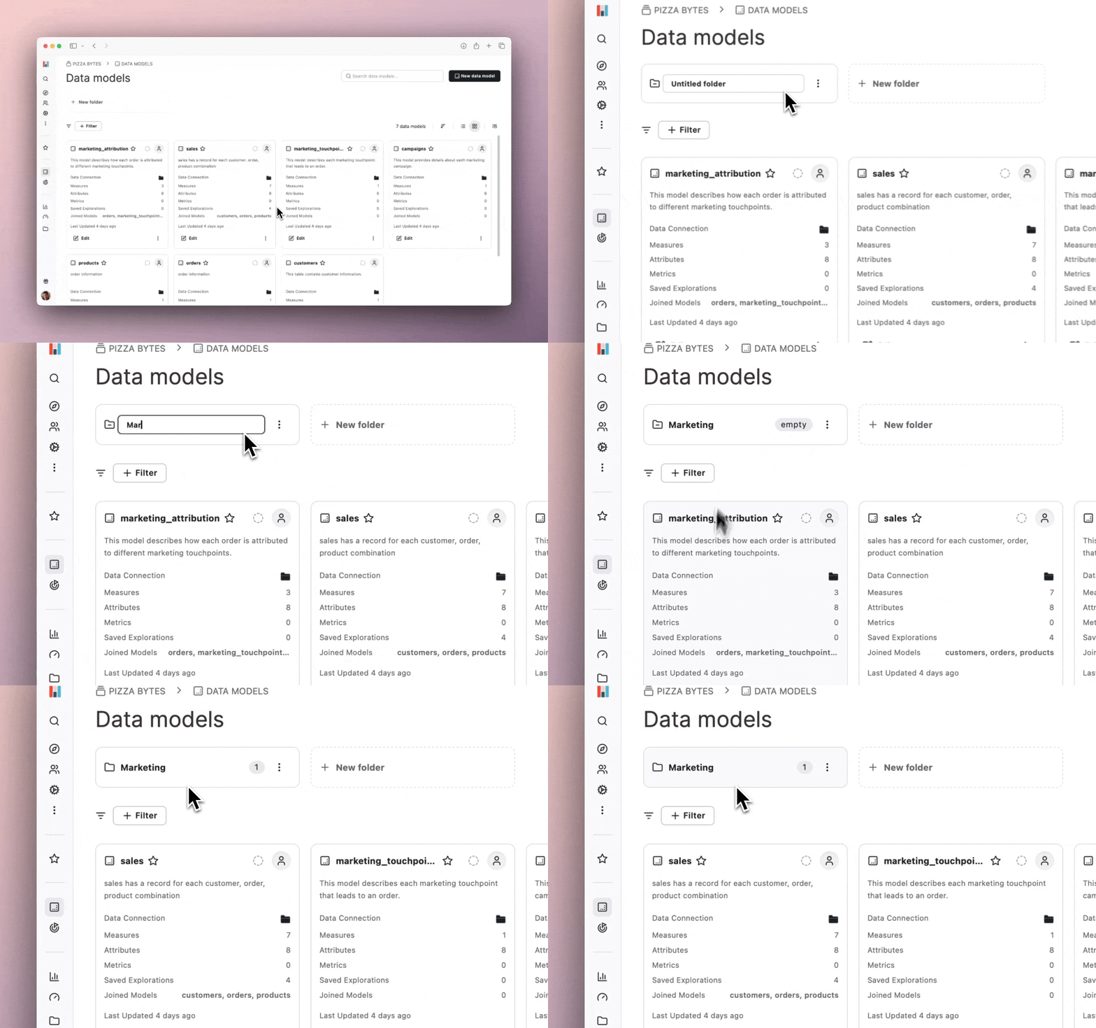
Data models are the core of your Hashboard project, empowering you to track key metrics and enable self-service exploration across your organization. However, as your organization grows and your data library expands, efficiently finding the right model can become a challenge.
To help tidy your data models page, we’ve introduced folders for data models. You can now organize each model in your Hashboard Data library into folders and subfolders that reflect your organization’s structure. These folders are fully linkable, making it simple to share or bookmark a specific folder for quick access and collaboration.
Head over to your project's data models page to start organizing your models.
Lock down who can verify resources
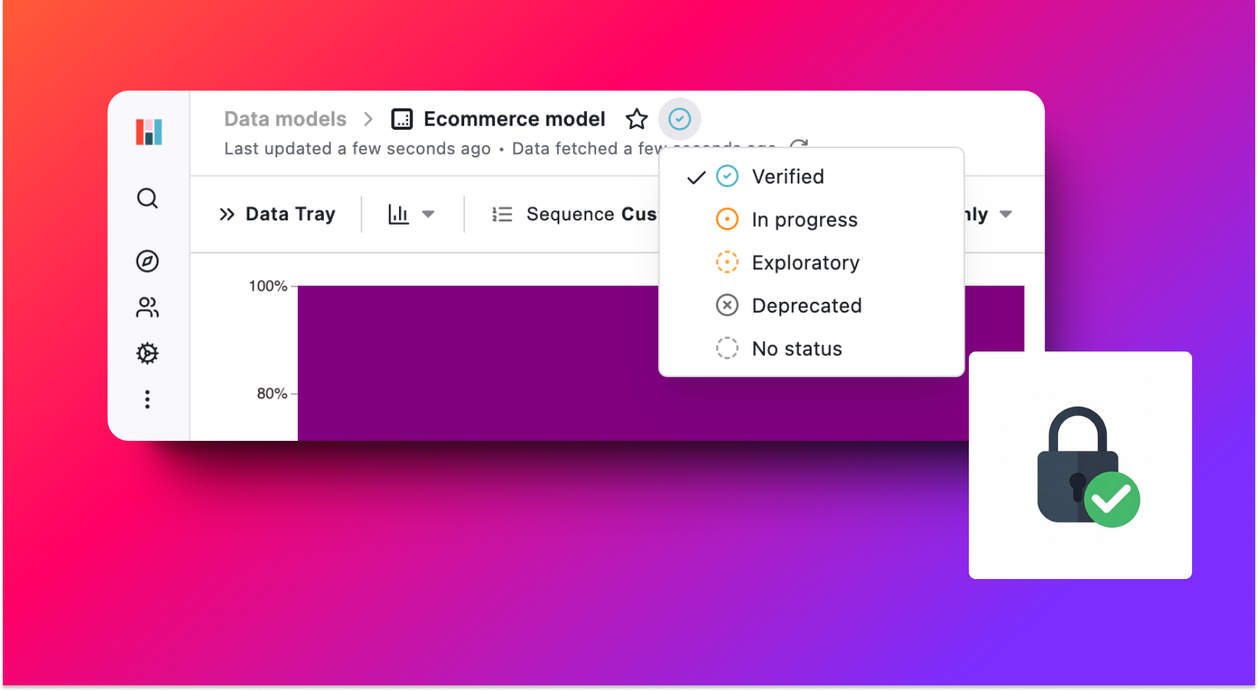
Ensuring the status of your Hashboard project resources (e.g. dashboards, metrics, or models) is accurate is crucial for maintaining data integrity and organizational trust. Resources marked as “Verified” signal to others they have been vetted and approved by the data team. However, mistakes can occur when status changes don’t align with your organization’s established review process.
To address this, we’ve introduced new resource status permissions that ensure only authorized users can make these changes, strengthening the reliability of your verification system and helping maintain the integrity of your verified resources.
Calculations Table
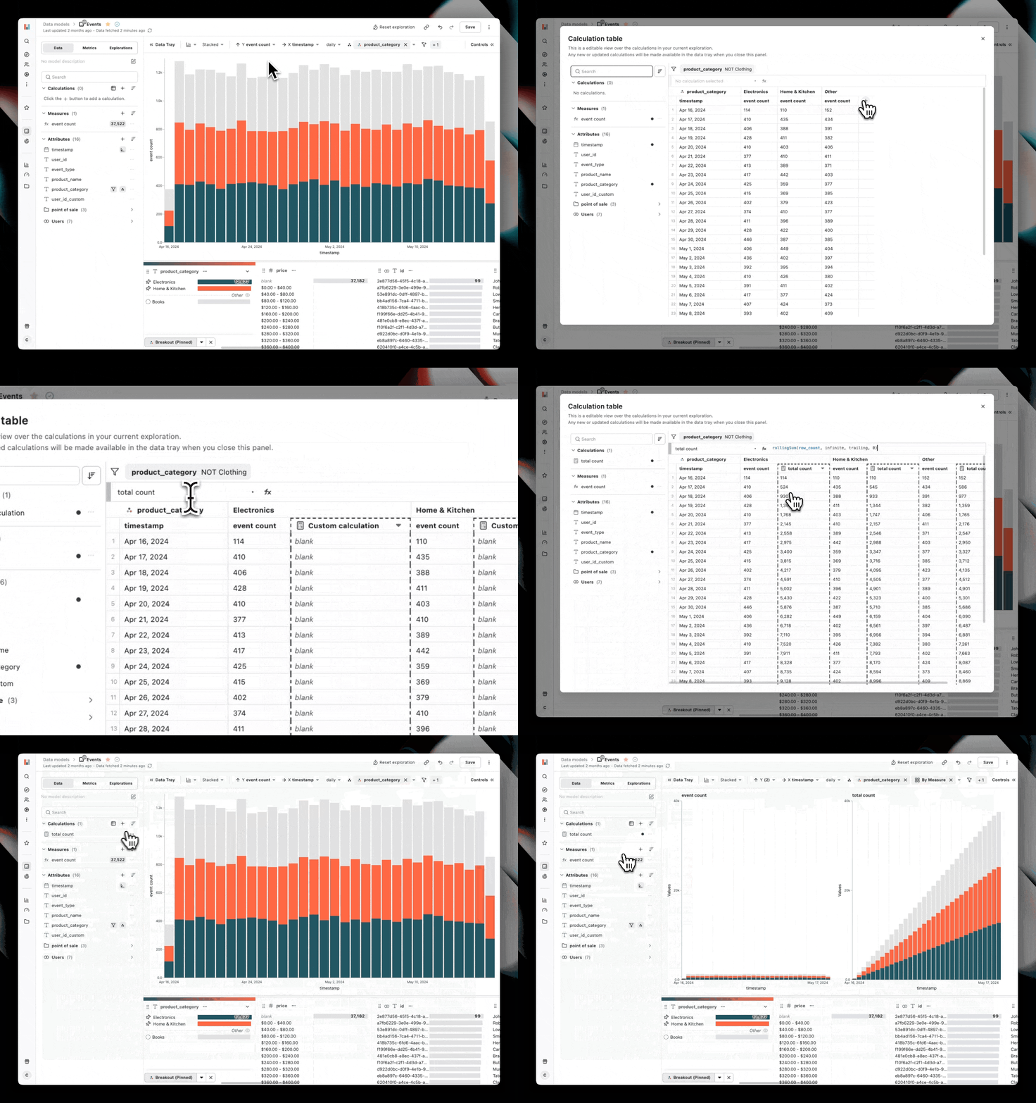
Today we're introducing the Calculation Table — a new, spreadsheet-style interface with a formula bar to quickly add, modify, or omit calculations on your current exploration.
The calculation table provides an overview of your chart's data frame, including any pivots, allowing you to test and verify your proposed changes before visualizing the results.
The Build and Draft Detail Pages Have a New Look
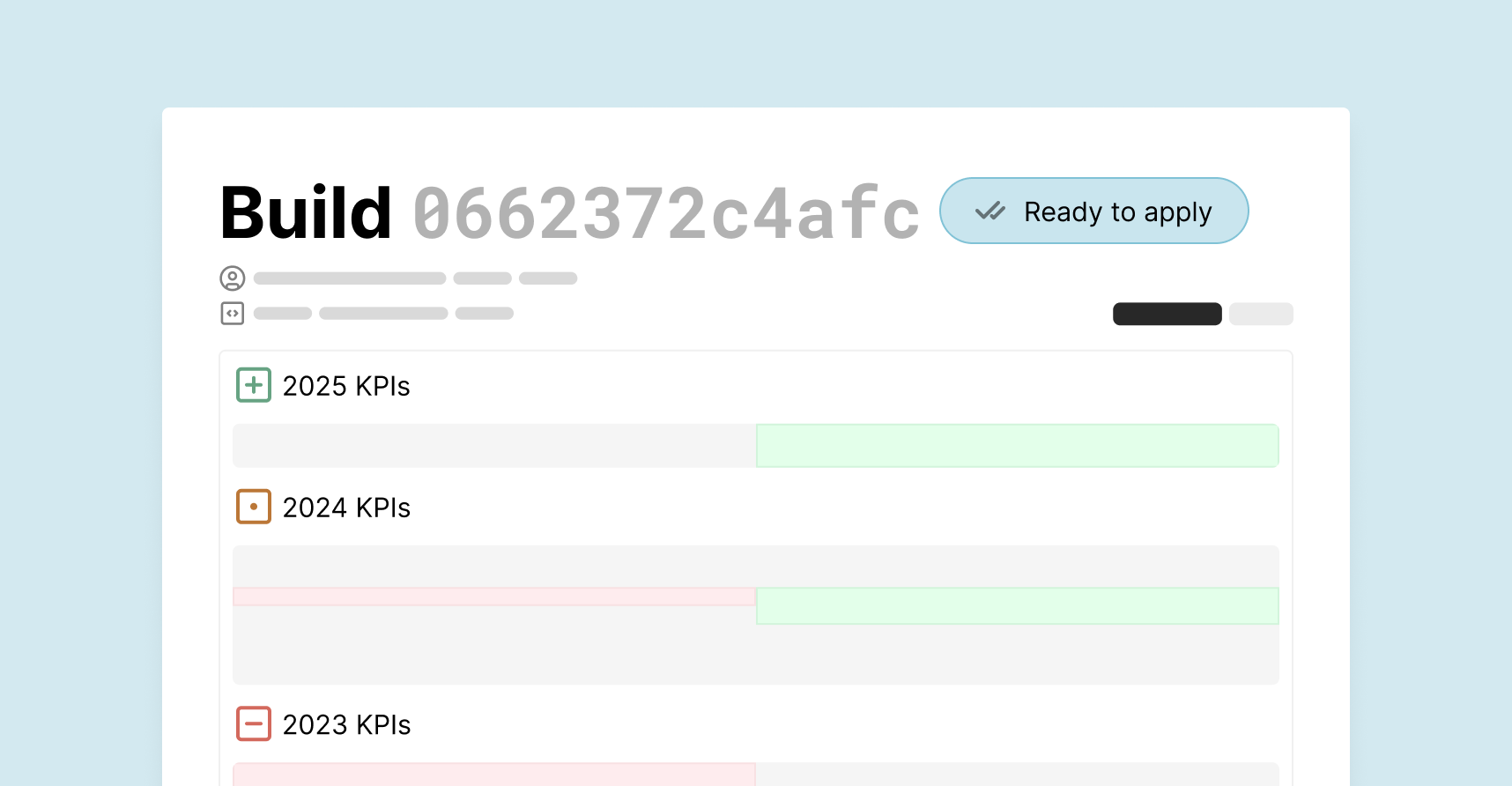
The Build and Draft pages have a sleek new look! The improved layout features highlighted code diffs in an easy-to-navigate list to help you quickly identify key changes. The new workflow is useful for browsing builds with a large number of updates.
Check out the new features by starting a project draft or creating a build with the Hashboard CLI.
Model Default Exploration
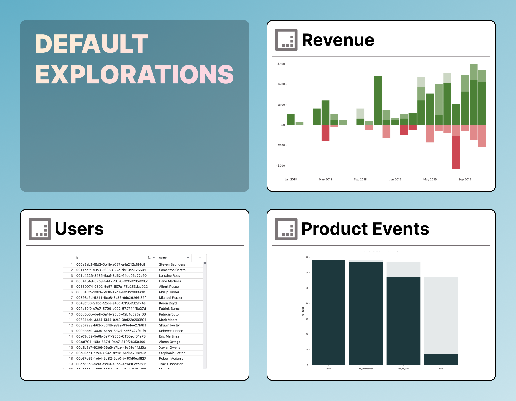
Data models often have an ideal way to be displayed such as using a table to display user records, or a funnel to showcase of marketing events. Now you can specify a default exploration for your data model to provide users with a curated starting point. Your predefined visualizations and filters will help your users arrive at insights faster.
Set up a model’s Default Exploration today using the code editor in the model builder. (Learn about the YAML spec in the docs)
Accelerate Data Modeling Edits with AI-Powered Model Builder Assistant
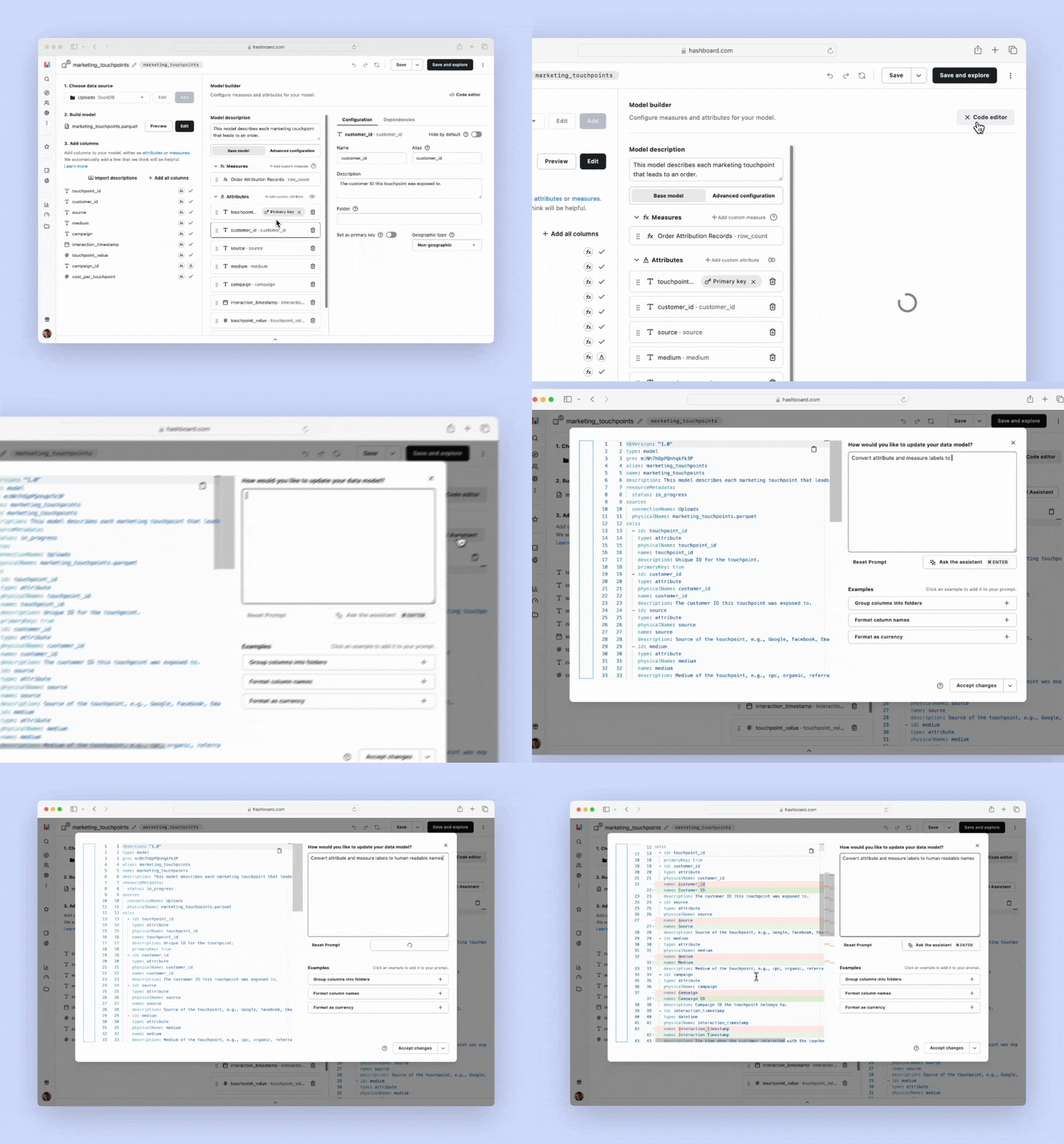
Building data models can be a complicated process. Data models need clear, concise names, descriptions, and folders for your attributes and measures. You might need to define custom measures or attributes powered by SQL or add the correct numeric formatting for all your measures.
To aid in model development, we’re thrilled to unveil our new AI assistant. This intelligent assistant takes on the heavy lifting, enabling you to clean up your models with just a few prompts. You can edit the AI-generated suggestions, so you can review and adjust in real time.
Open a data model in your project to try out the AI assistant and take your data modeling to the next level.
Enhance collaboration with Draft-Specific Permissions
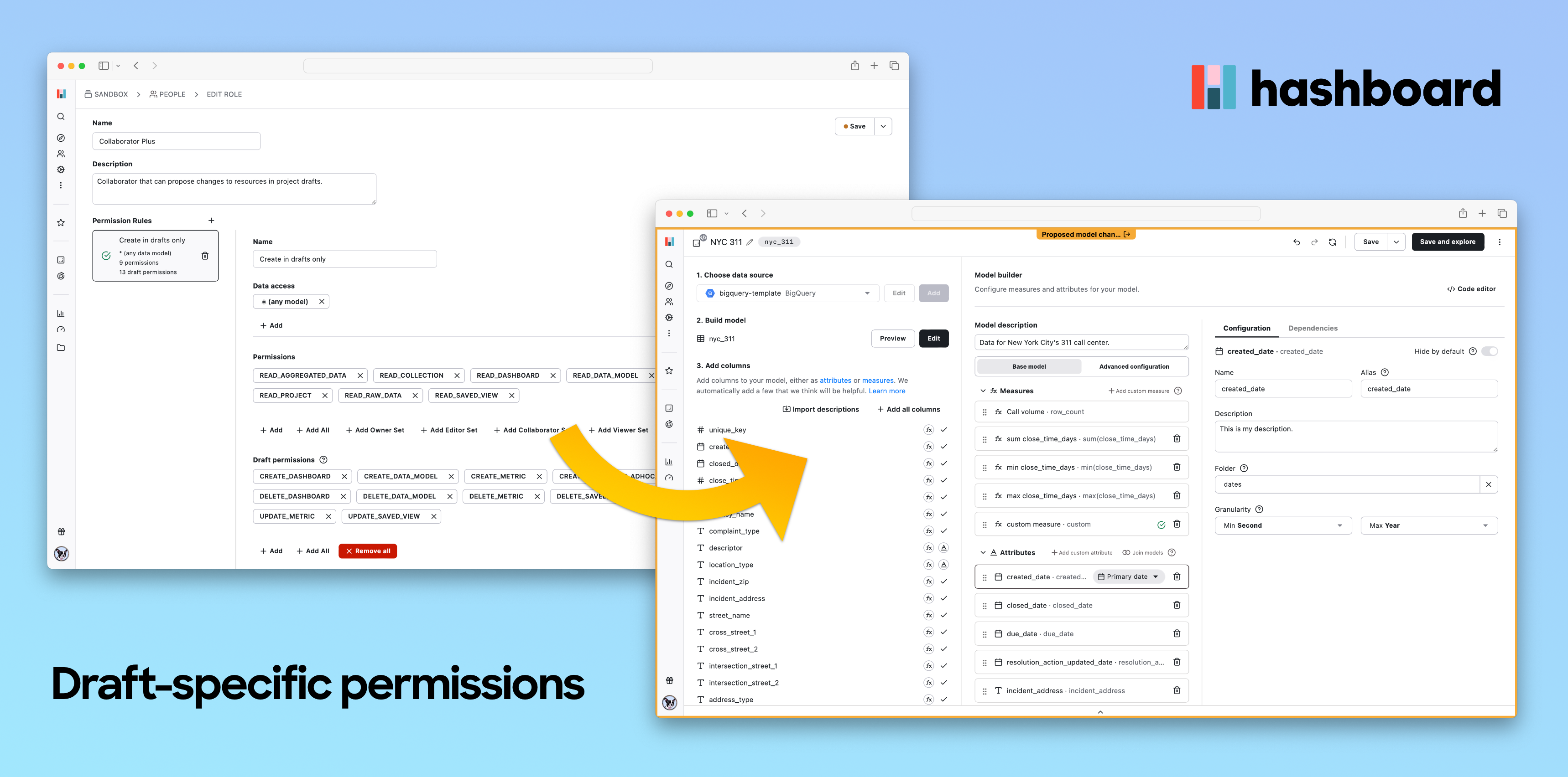
Draft-specific permissions are now available. This feature addresses a common challenge: empowering team members to suggest changes and improvements without risking unintended modifications to live projects.
When draft permissions are configured, users, normally unable to create or modify data models, dashboards, or metrics can now make adjustments within project drafts. These draft changes can be reviewed and applied by a user with full permissions, ensuring that ideas can be properly tested and refined while preserving control over final project updates.
To make these draft permissions easier to manage, we’ve given the role edit page a new design.
Head to your project’s roles page to configure draft permissions and get started today.
Improved Workspace Navigation and Resource Curation
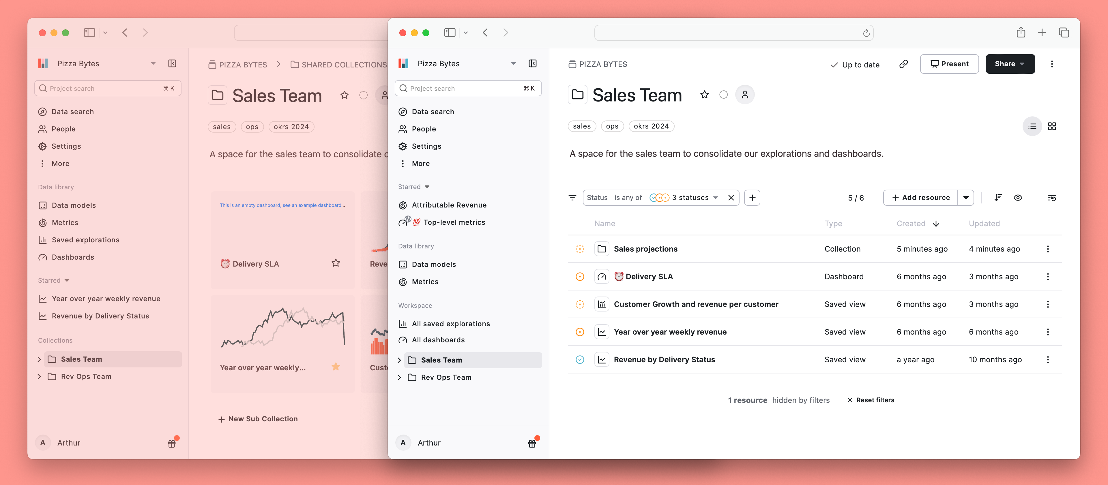
Do you wish you could better curate your project resources? We've added a new project-wide default status filter, allowing project owners to set a default resource view for all users based on the status of your resources.
We've also reworked the way you navigate your project: Dashboards and Saved Explorations are now found in your project’s “Workspace” (formerly Collections), creating a central location for explorations. And we've added the ability to switch between list and grid views in your collections.
Go to your project to try out the new resource curation features yourself.
Two-Way Sync Between dbt and Hashboard
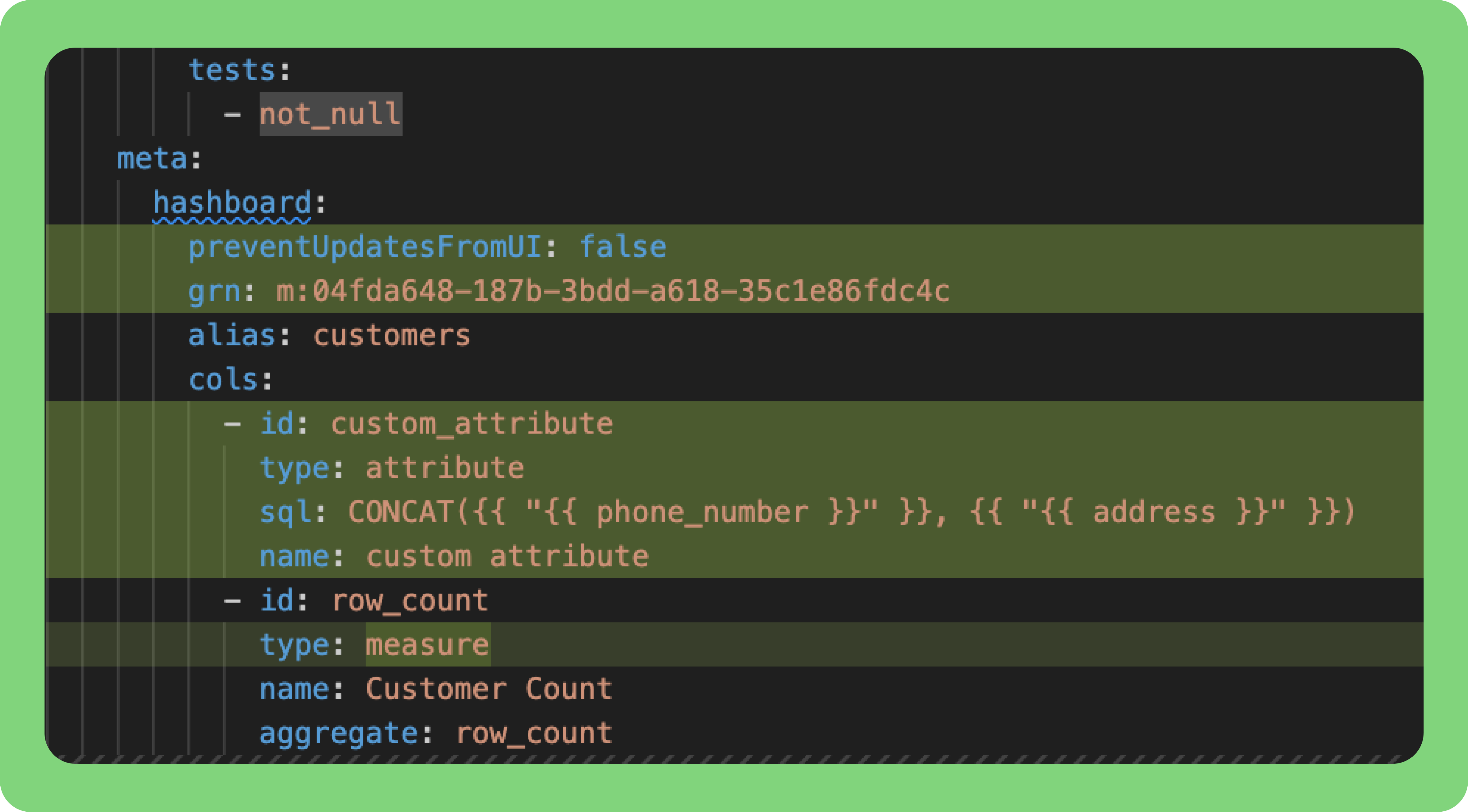
You can now sync UI updates made to Hashboard resources directly to your dbt properties files by using hb pull --include-dbt. This bidirectional feature ensures developers iterating on models in code or those using the UI can stay on the same page. Avoid resource definition drift by integrating this functionality in your development workflows and continuous integration processes. Visit our docs to learn more!
Fine-tune access to downloads and exploration
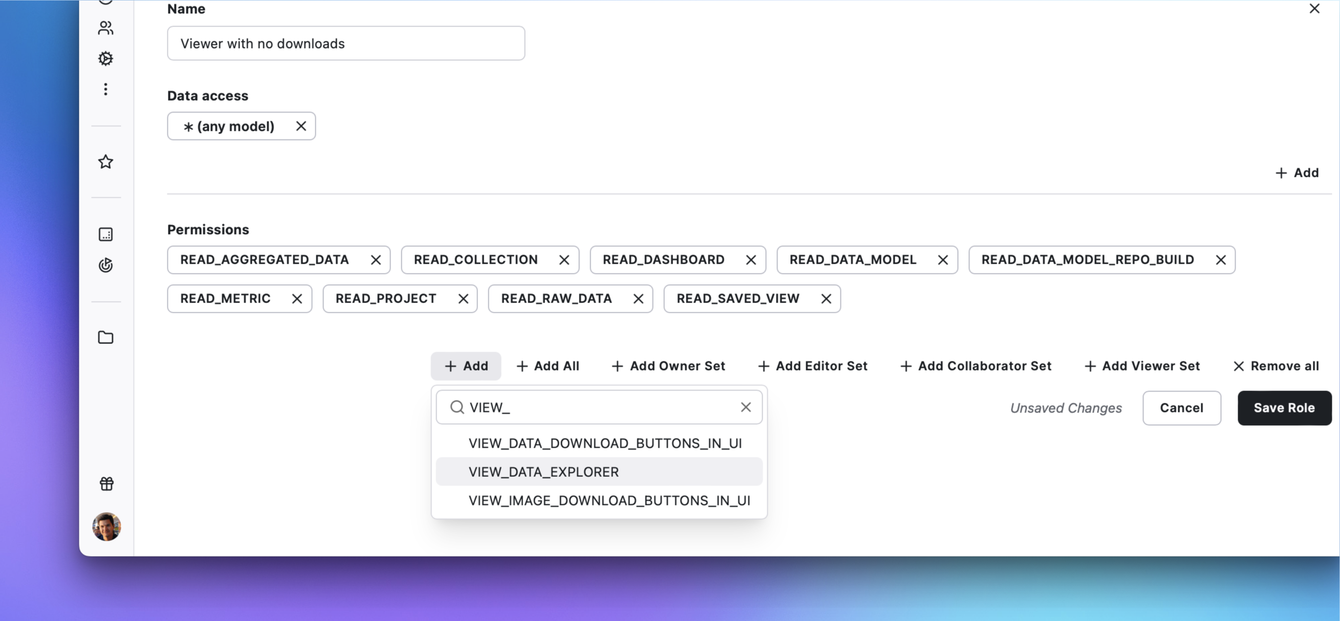
Need to restrict data downloads on dashboards or chart image downloads on saved explorations? Want certain users to only explore existing dashboards and not be able to create new explorations?
Introducing three new permissions to precisely control the Hashboard user experience. Through granting or revoking these permissions, you can take more granular control over the download options on dashboards and saved explorations, as well as the ability to create new explorations.
See our documentation for an overview of Hashboard's permissions.
Email PDFs of your dashboards and charts
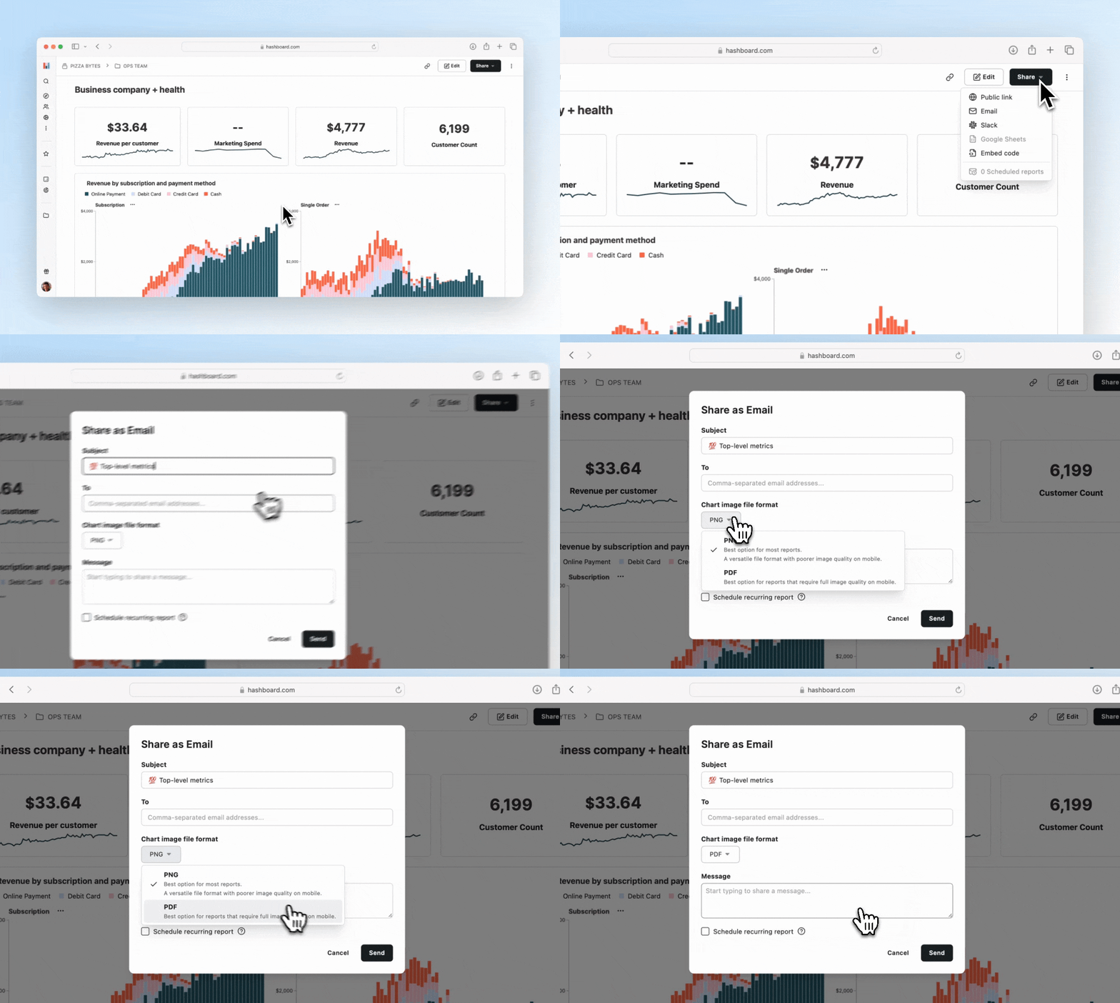
We’ve expanded Hashboard’s email reporting capabilities to include PDF as an option for your chart or dashboard image.
PDFs are a great way to consume email reports on mobile devices. Some email clients and browsers will down-sample image attachments but PDFs often retain their original resolution, making them a great option for viewing your high-resolution data on the go.
Send your first PDF via email by picking a saved exploration or dashboard from your project and selecting Email from the Share menu.
Audit your project’s reports
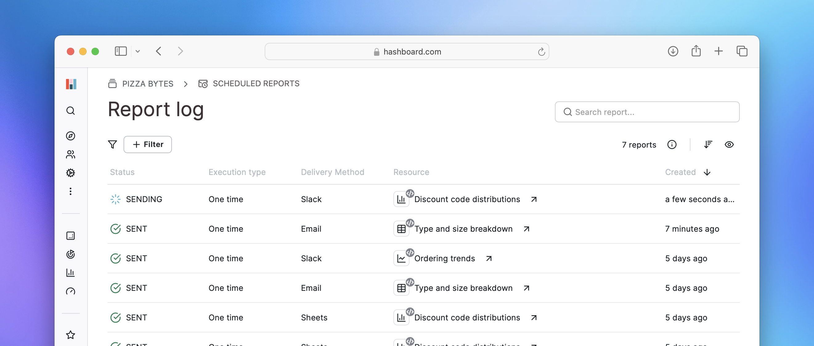
Hashboard now lets you monitor and audit the status and details of scheduled and one-time report runs. With the ability to sort and filter based on status, destination, delivery method and timing, managing and troubleshooting your reports is more straightforward, ensuring that your data deliveries remain accurate and up-to-date.
Get started by checking out your report log in Hashboard or send your first report from one of your saved explorations or dashboards via the Share button.
Export and schedule data to Google Sheets
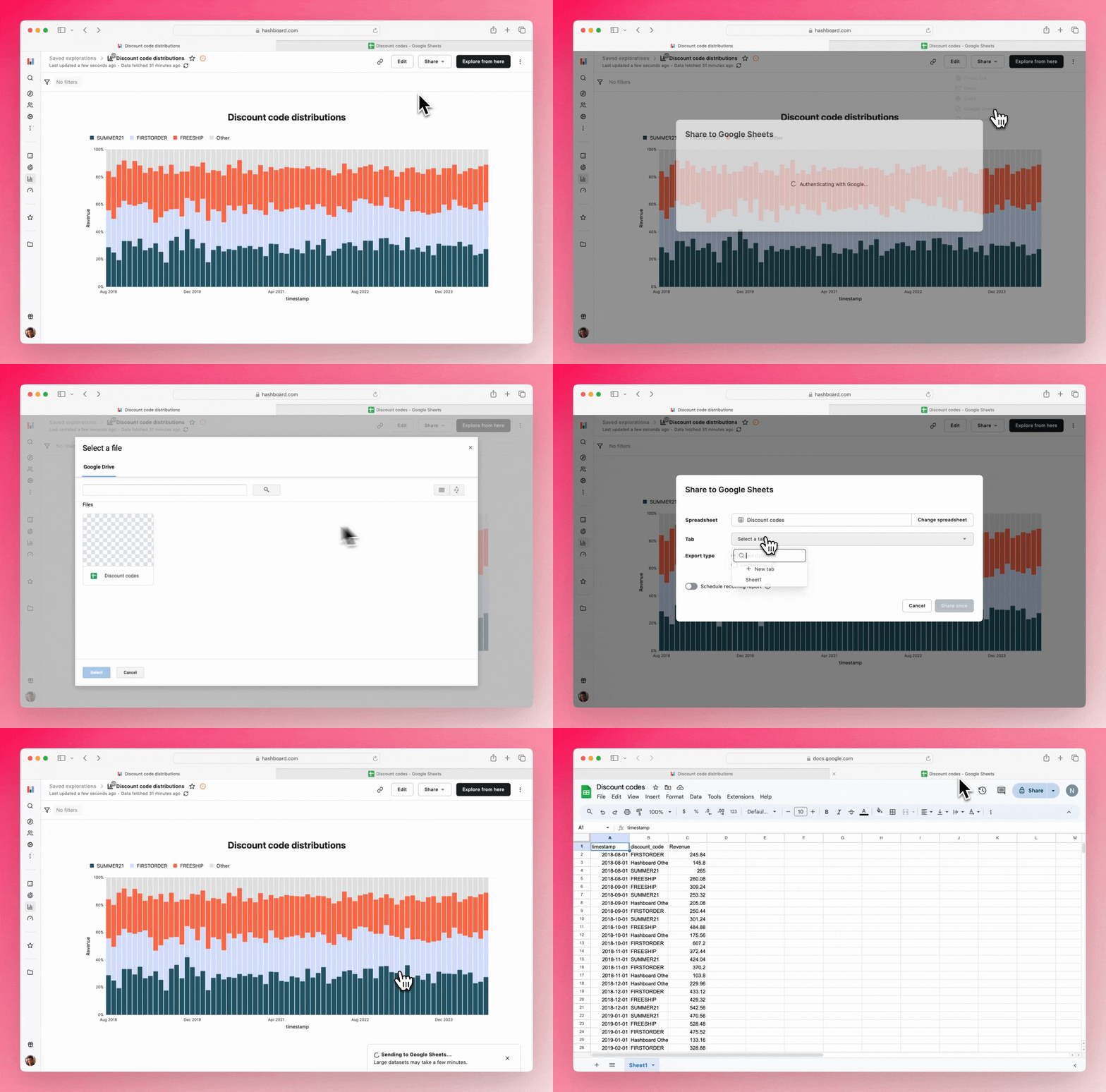
You can now export chart data or underlying data from your saved explorations in Hashboard directly to Google Sheets. This feature allows for both one-time exports and scheduled reports, giving you the flexibility to keep your data in sync on a user-configured schedule.
When setting up an export, simply select your desired spreadsheet and choose whether to target an existing tab or create a new one—we’ll handle the rest.
This new capability unlocks powerful workflows, such as automatically updating spreadsheets or lists embedded in Google Docs or Slides, ensuring your presentations and documents always reflect the latest data from your saved explorations.
To configure your first export to Google Sheets navigate to a saved exploration in your project and pick the Google Sheets option from the Share menu.
Leverage New Build Workflows in v3 of the Hashboard CLI
.png)
We’re delighted to announce version 3 of the Hashboard CLI. It extends our existing dbt integration to now support Slim CI workflows, dbt deferrals, and partial updates to code-controlled Hashboard resources. After the initial build process, changes are instantly applied and can be executed from either the CLI or the UI, accelerating the development process.
For more information on migrating from CLI v2 to v3, visit our migration guide. To learn more about how to integrate our new build workflows with your CI/CD processes, please take a look at our example GitHub actions.
More options for sending data in email reports
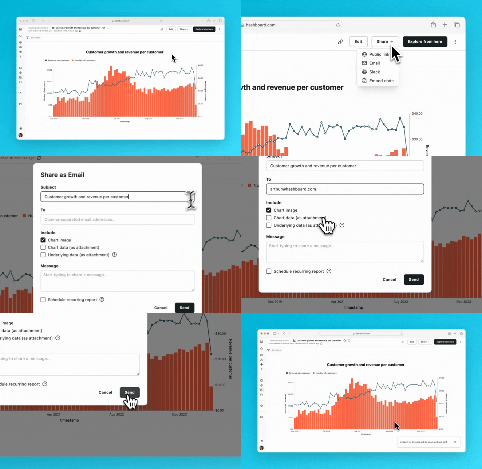
Now you can choose between sending raw underlying data, or aggregated report data as attachments to your emails (or both!). And of course you can still send chart images in emails for a quick visualization of your data. This new feature lets you share curated data represented in your charts, including calculations, ad-hoc measures, and ad-hoc attributes.
See our documentation for more details on how to configure email reports.
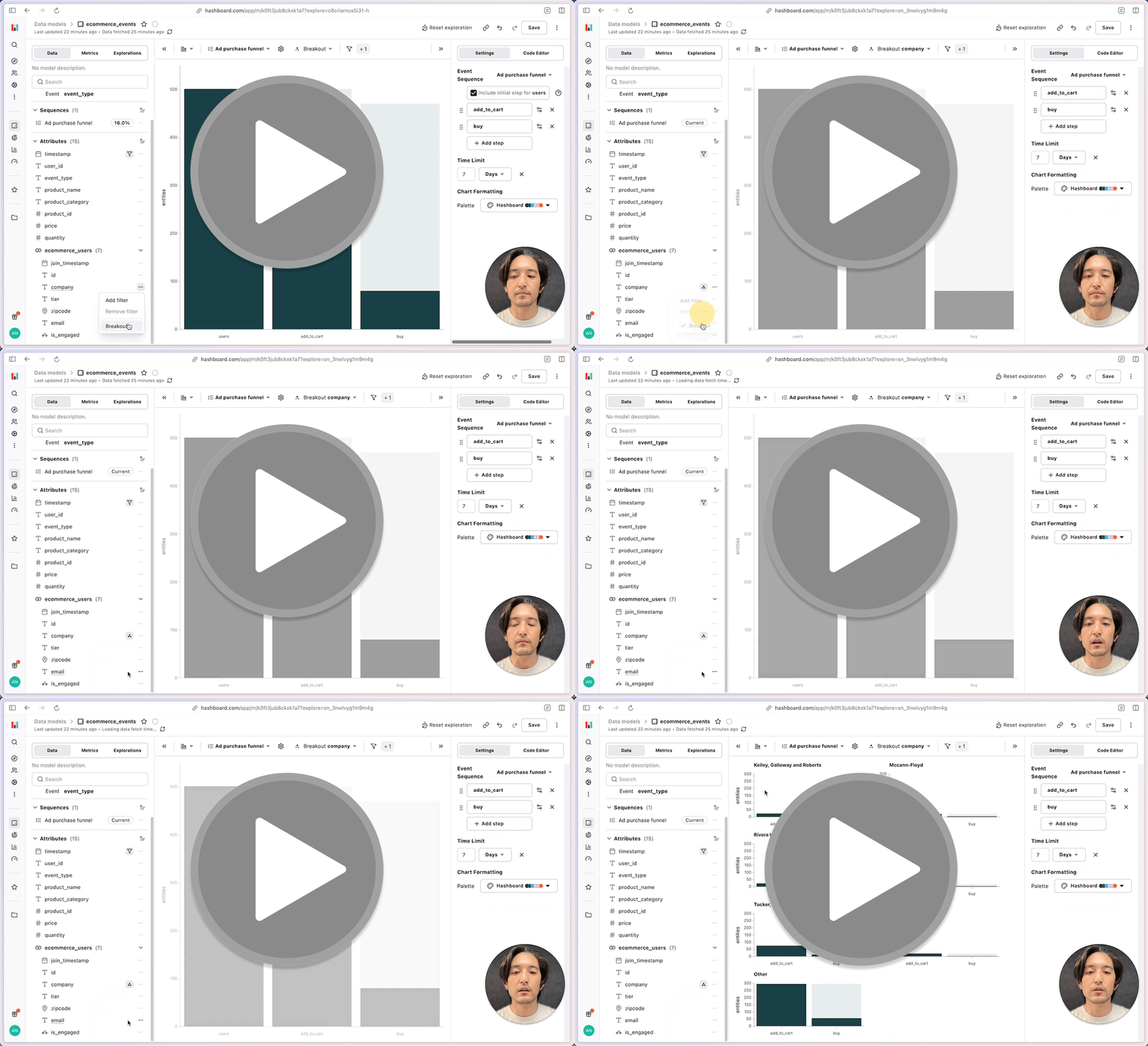
Funnel Breakouts
A funnel analysis can identify drop-offs in user journeys, but it lacks the granularity needed to pinpoint variables for improvement. Hashboard has added Breakouts for funnel and conversion analysis, allowing you to segment and compare performance using Hashboard models attributes.
To learn more read the docs!
Custom explorations for dashboards
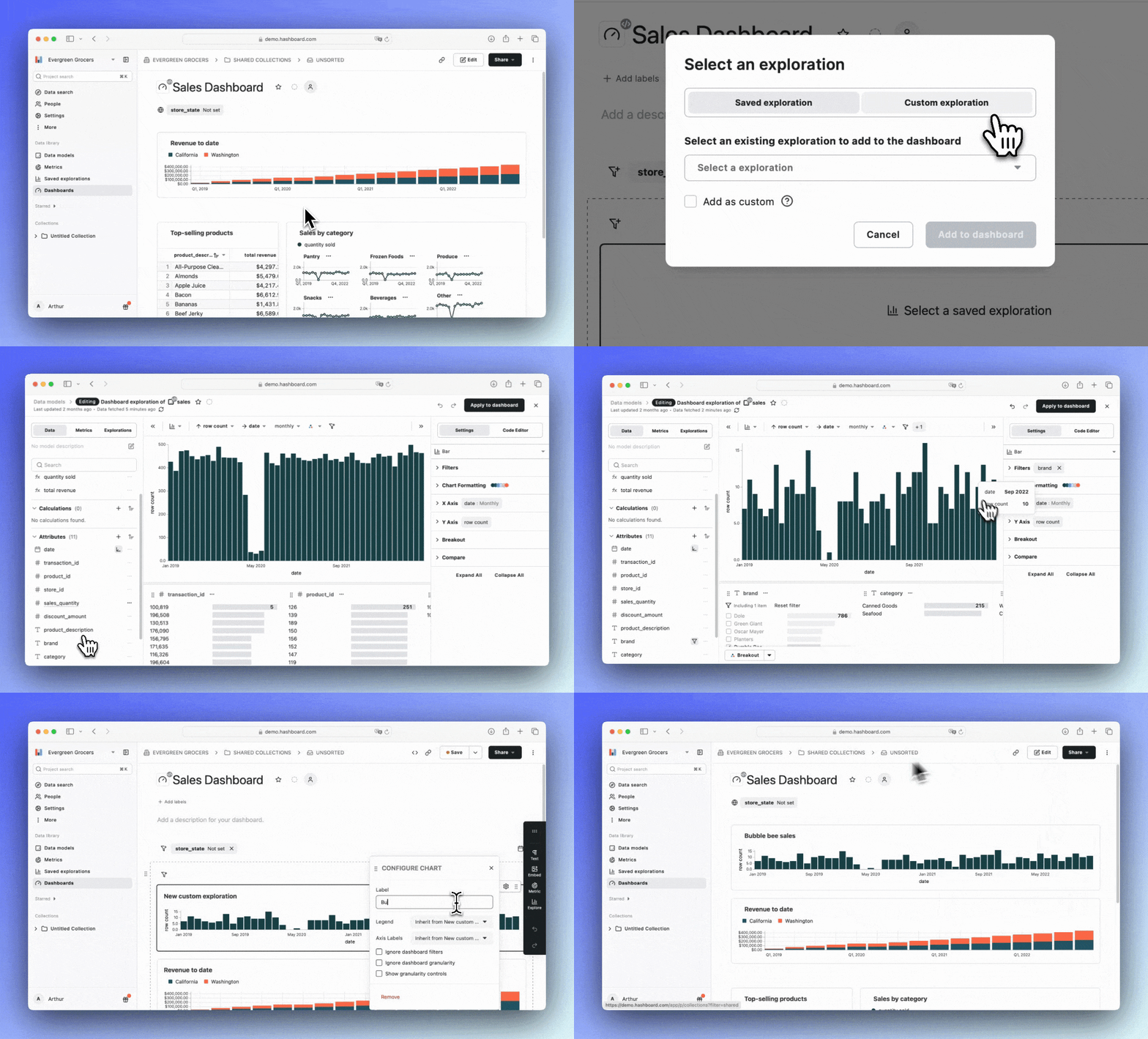
Creating compelling data stories within your dashboard is now faster and easier than ever.
With Hashboard’s latest update, you can specify and add charts directly from within your dashboard without the need to create a separate exploration. Visualizations added this way remain entirely within the dashboard, reducing clutter and simplifying your code-based workflows.
Read more about dashboard explorations in our docs.
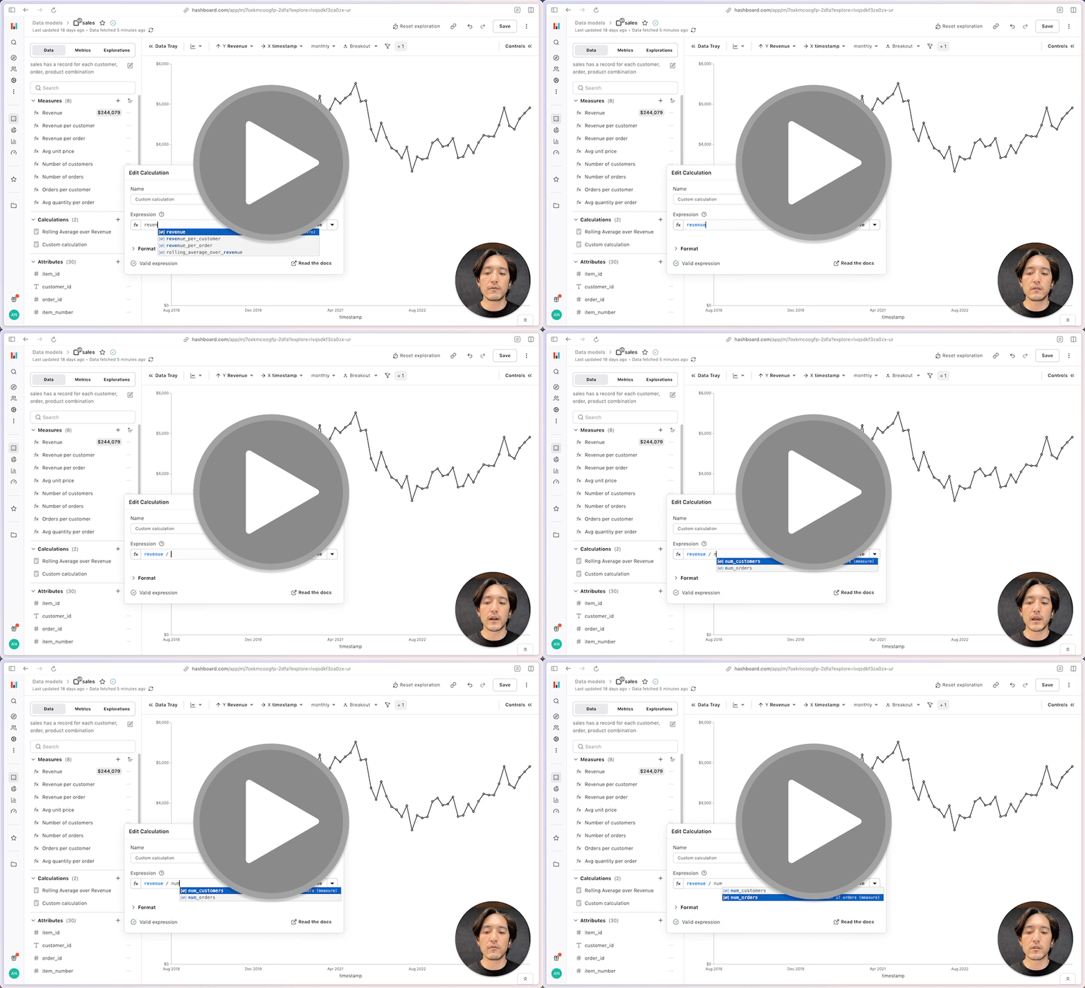
Custom calculations
Need to subtract one measure from another right from your current exploration? Want to compute a rolling average using multiple existing measures with different weights? Want to do all this without needing to understand the underlying SQL?
Now, with custom calculations, you can build complex calculations on the fly using our powerful formula editor. Customize the arguments of our builtin functions, reference other measures or calculations, and create dynamic insights directly within your charts.
Check out the documentation for an overview of everything you can do with calculations.
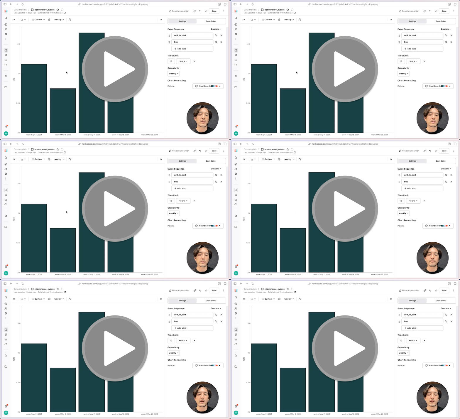
Conversion Rates
Earlier this summer, we released support for basic funnel analysis! This is useful for one-off analyses, but tracking funnel performance over time is important for evaluating the impact of changes you've made.
We've now extended the capabilities of Hashboard's funnel analysis to support measuring conversion rates and time-to-convert, over time. Try it out in the Explorer!
Check out the documentation for an overview of our event analytics features. You can also find a walkthrough of how conversion rates are computed.
Our new Dark Mode is easy on the eyes
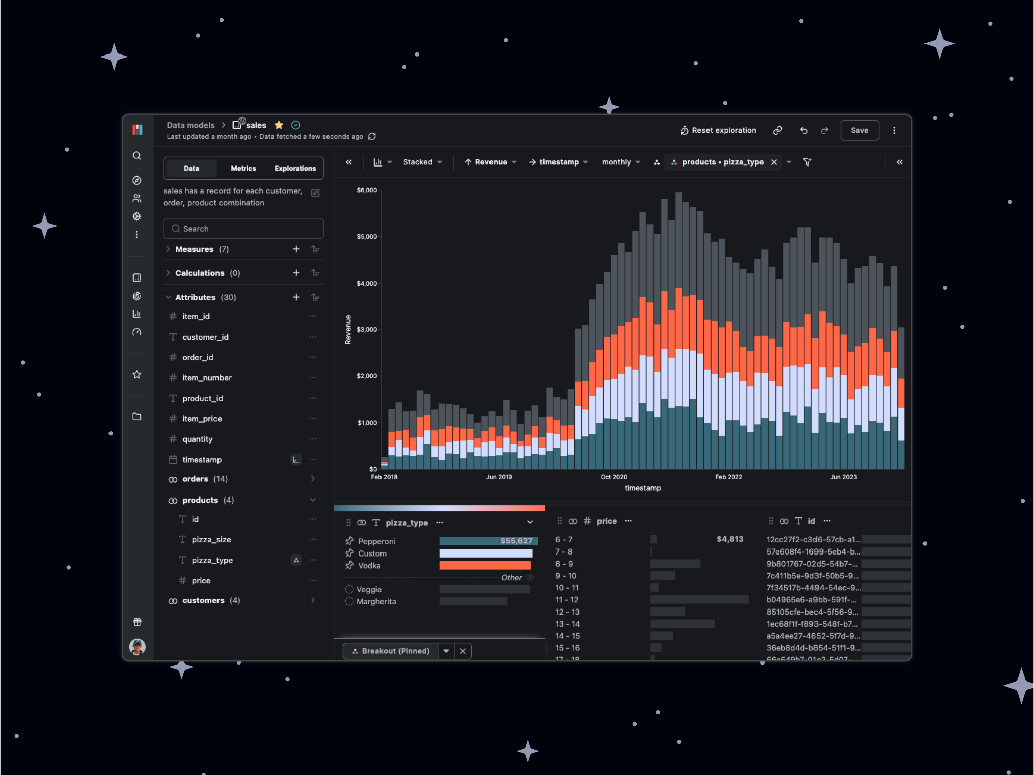
When you prefer dark mode, you want everything to be dark mode. Hashboard now supports Dark Mode across the entire application. Navigate to your profile settings to switch on the new dark experience.
Hashboard makes building and reading Metric Trees easy

Hashboard already features a Metrics page, a central hub for defining business metrics. However, the relationships between these metrics can sometimes be unclear. To address this, we've added the ability to define Metric Trees, allowing you to specify which metrics drive other metrics.
With this update, these relationships are visualized in a folding tree structure. This enables you to inspect the performance of all your business metrics on a single pane of glass while also drilling down into driver metrics.
Read our docs to learn more!
Now THIS is drafting!
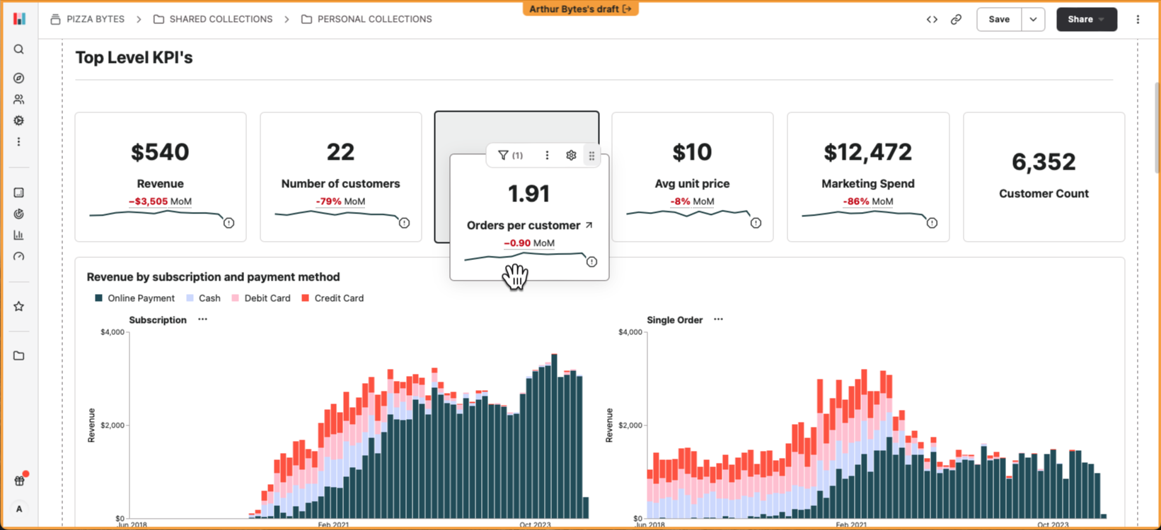
Drafts let you test or propose changes to your Hashboard project safely. Drafted resources can be created, updated, and deleted, then applied to your project in a single operation.
Check out our documentation to learn more about creating, applying, and working with drafts, or head to the Drafts page to get started!
Funnel Analysis
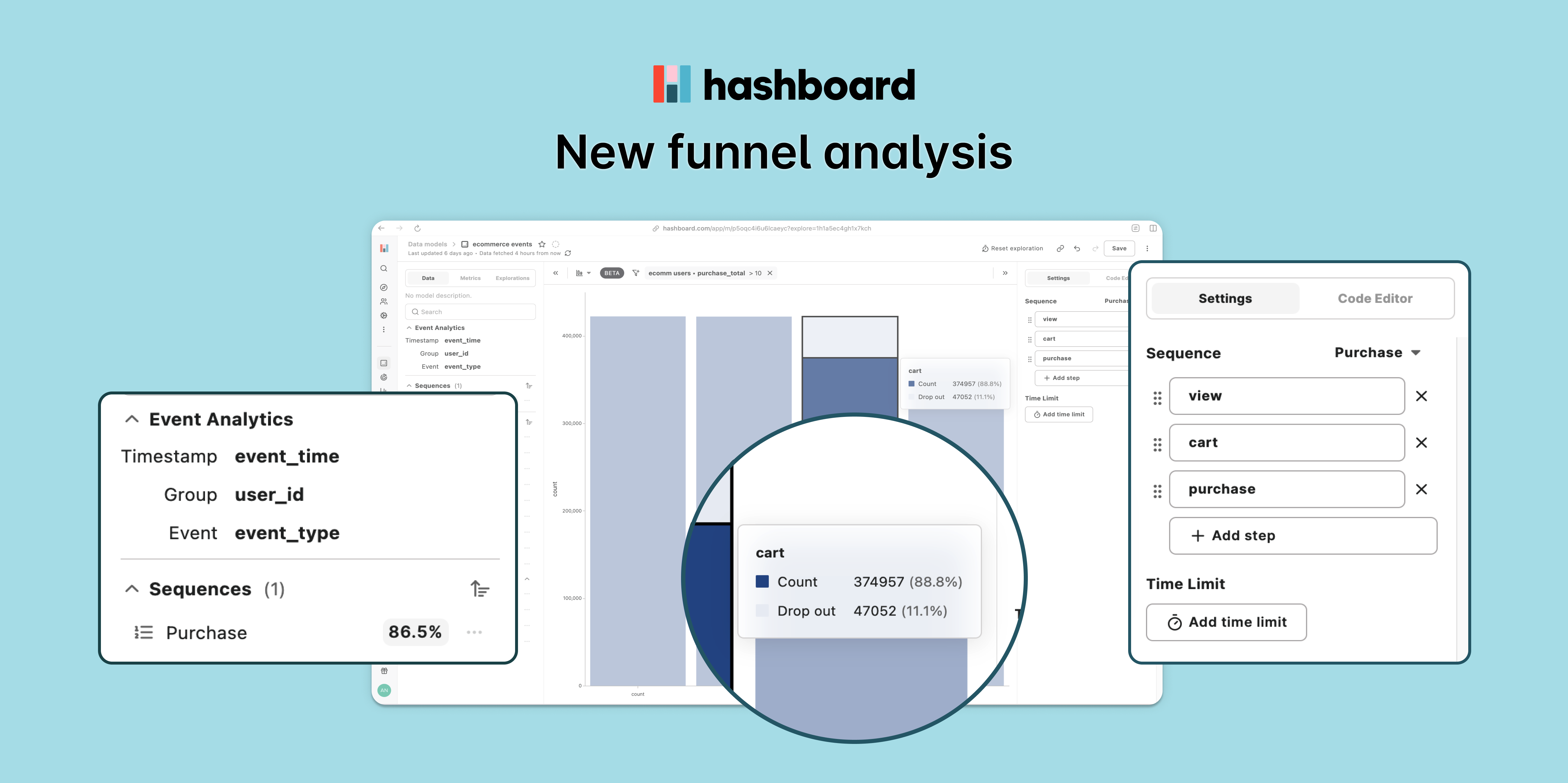
Building funnel analysis in your BI tool used to be difficult and brittle. Now, by adding a bit of additional configuration to an existing data model, you can begin interactively analyzing funnels in Hashboard. You can define event sequences with names, descriptions and time window limits, making it simple for everyone to analyze user behavior and identify areas of improvement.
Check out our documentation to learn how to set up event analytics.
Paste Values Into Filters
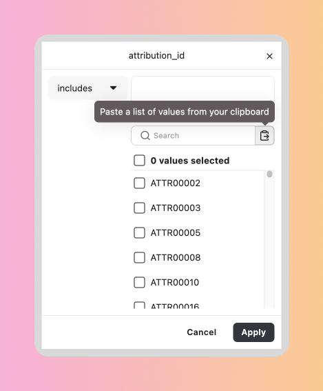
You can now directly paste long lists of values into filters from your clipboard. Adding filters based on lengthy lists of user IDs or emails from another system used to be time-consuming. Now, simply copy the list to your clipboard and click the paste button in our filter UI.
Numeric attribute formatting
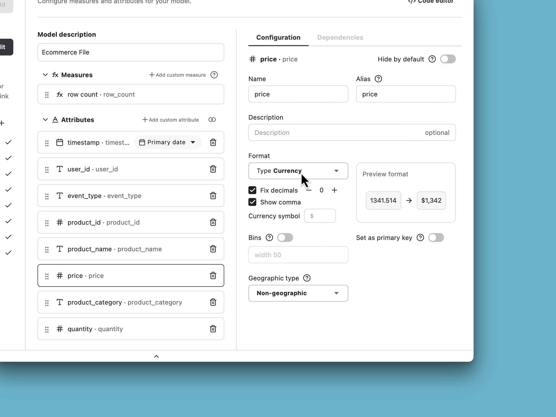
Customize the formatting for numeric attributes in your data models. You can select your decimal precision, show and hide commas, customize your currency, and more.
Improved Resource Lineage
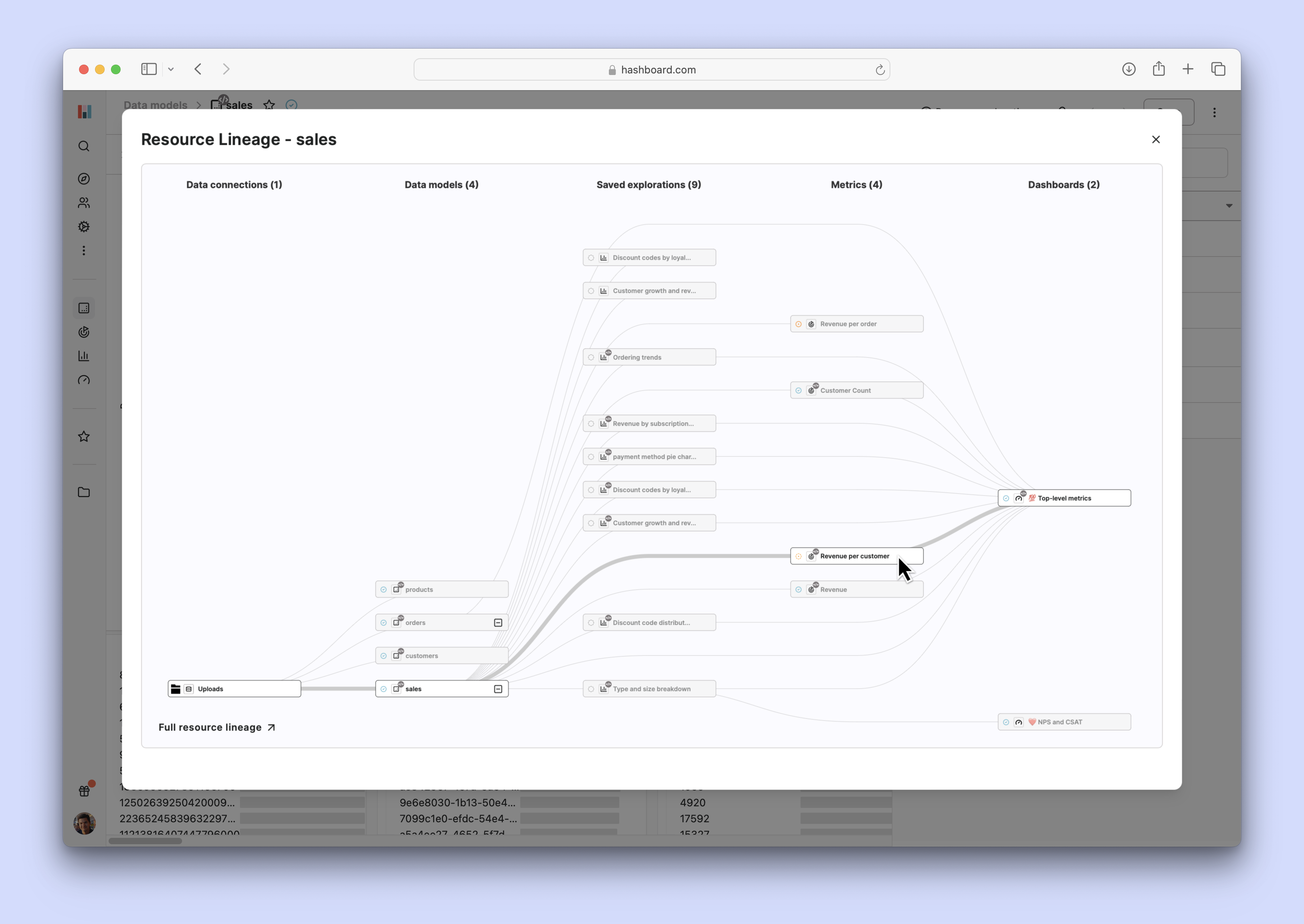
Visualizing the relationships between your resources can be invaluable. That's why we introduced the resource lineage feature. Today, we are excited to announce several enhancements to make it even more powerful.
You can now view your project metrics directly within the resource lineage. Additionally, you can see the specific resource lineage for each metric from the metrics page. Trashed resources are hidden by default, but you have the option to toggle their visibility. We have also added the ability to collapse data models along with all the resources that reference them.
Finally, we have redesigned the entire resource lineage interface and introduced resource and status icons for each resource node.
Early Access to Funnel Analysis
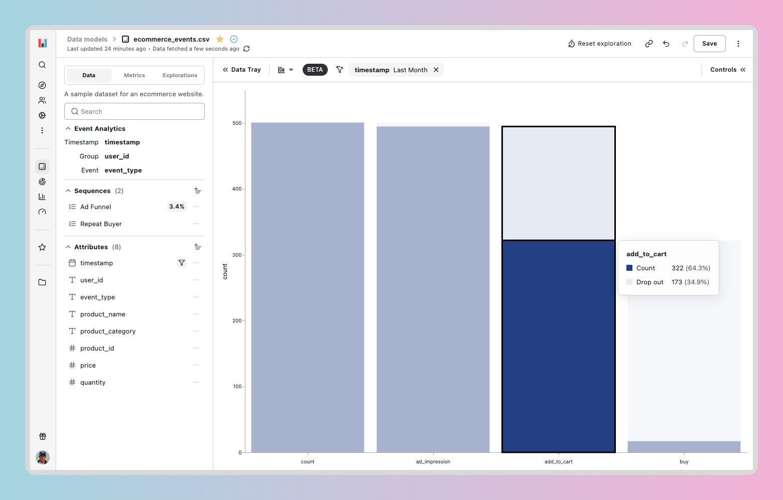
Funnel analysis is now available for public preview in Hashboard. You can now define event sequences with names, descriptions and time window limits, making it simple for everyone to analyze user behavior and identify areas of improvement. In the spirit of accessibility and flexibility, funnels can be visualized with both tables and bar charts.
Asynchronous DataOps builds

Hashboard is excited to launch our new asynchronous build feature! Now, you can initiate your builds and monitor their progress in real-time directly at the command line or on hashboard.com. We've also improved our support for long-running builds, letting you track builds even if they take longer than 5 minutes.
This release marks the beginning of a lot new and exciting build features on our roadmap. Say tuned for more updates.
Dynamic Value Labels
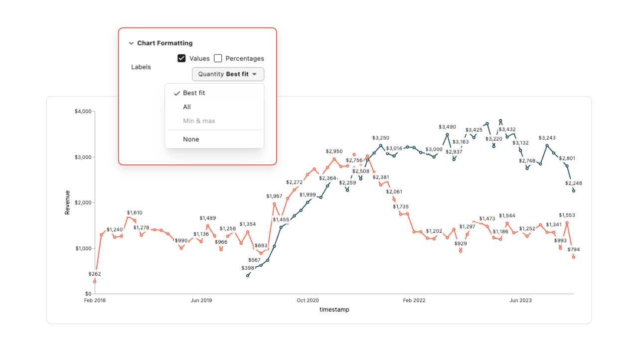
We’ve added a new option to dynamically layout the best number of value labels on your chart. Whether you’re viewing a chart on your laptop or your phone, you’ll always see the right amount of labels with “best fit” enabled.
Set Default Variables for UI Builds and Previews
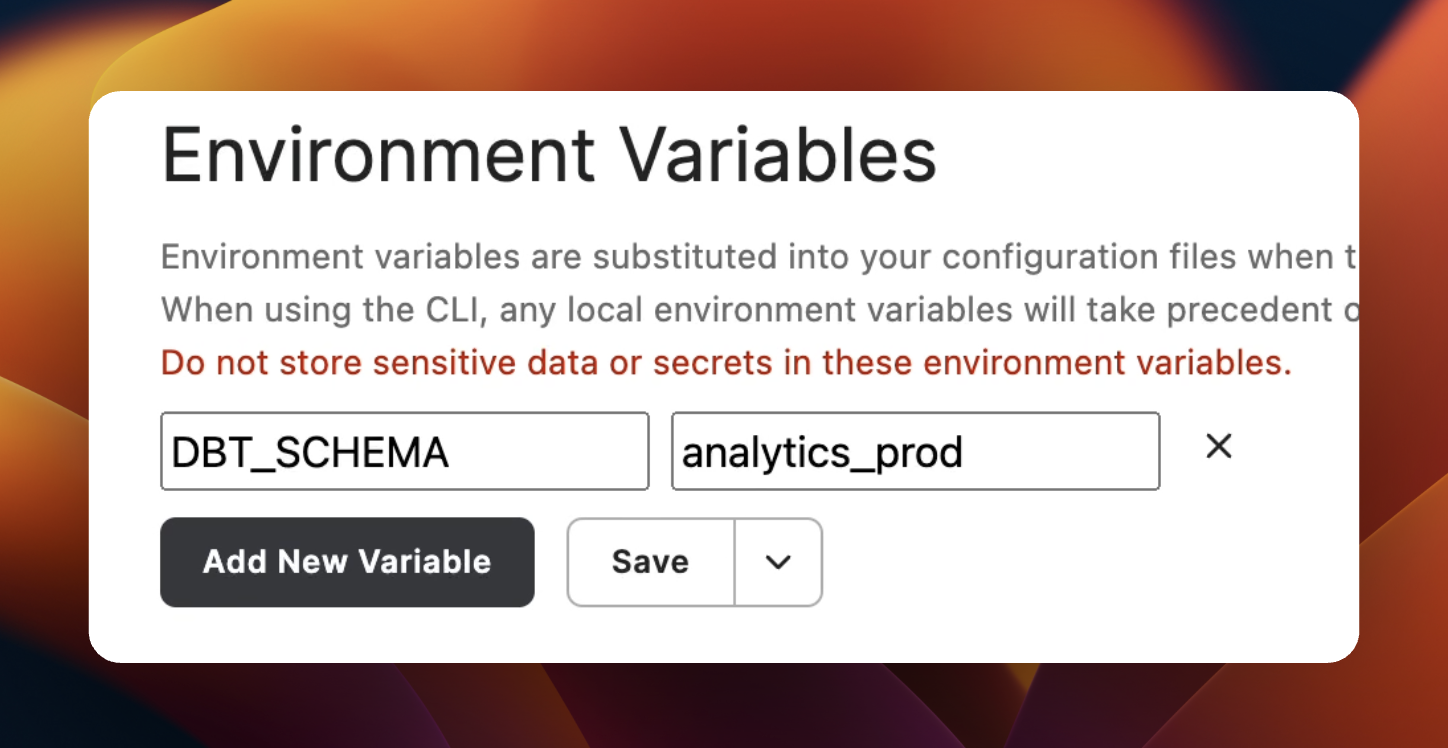
You can now configure environment variables for variable substitution in Preview and Deploy builds triggered from the Hashboard UI. These variable values will also be used as fallback values for any CLI builds. Read more in the docs!
Faster edit flows for saved explorations
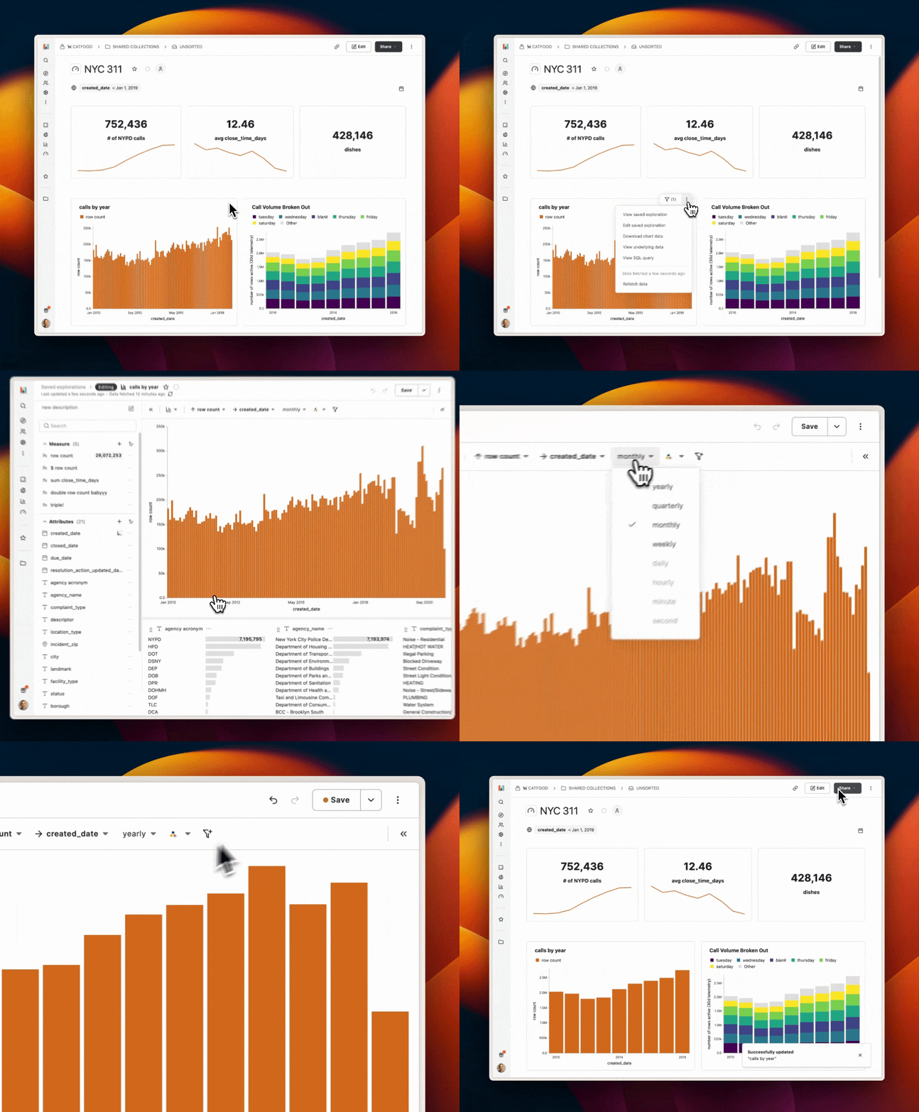
We've made it faster and more intuitive to update your saved explorations from anywhere in the app. Now you can swiftly modify a chart and get right back to what you were working on. Wherever you see a saved exploration, such as in a dashboard, you'll now find handy buttons and menu options to jump straight into editing mode.
After making changes to a saved exploration, simply save it and you'll be automatically returned to your previous location in the app. This makes updating dashboard charts a breeze!
Pie charts
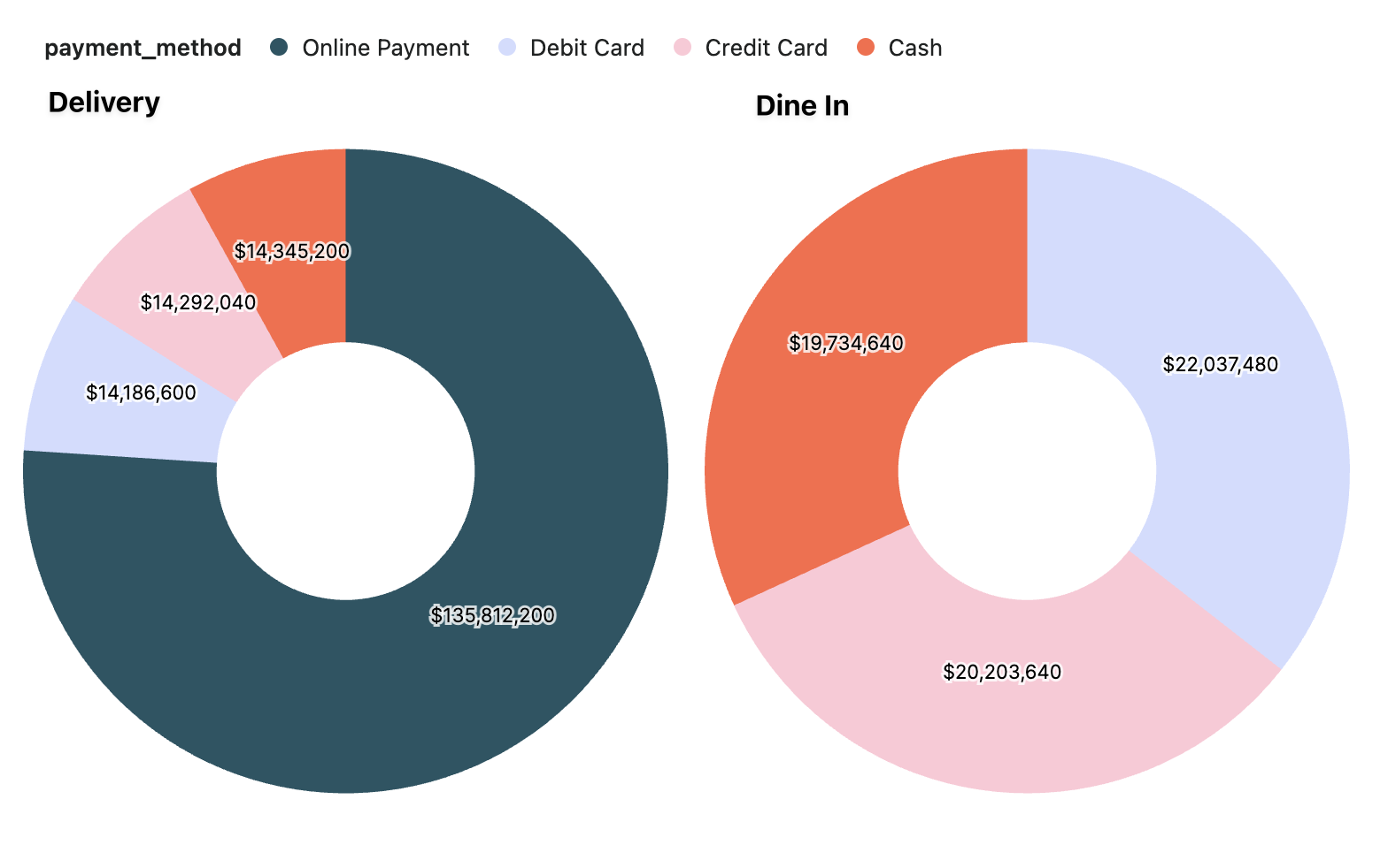
Introducing pie/donut charts, the latest upgrade to Hashboard's visualization capabilities! Create a pie chart when you want to depict proportional relationships in categorical data.
You can even trellis them to compare multiple categories at once.
Auto archive
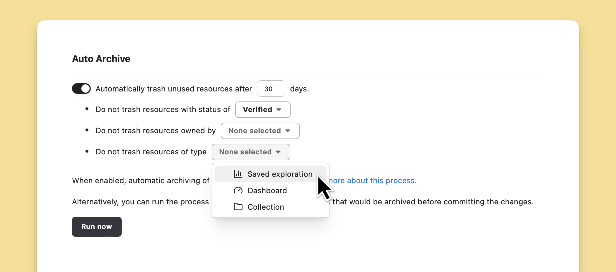
Every data team knows that countless resources in their BI tool are stale and unused. While maintaining a clean project containing only active resources is a good practice for data teams, it can still be scary to delete and get rid of unused resources.
Now with Hashboard's auto archive feature you can automatically, continually prune cruft from your project. We give you the power to configure the rules of what gets tidied and what gets excluded. Hashboard also has a full immutable history of the changes in your project, so any change through the auto archive process is 100% reversible.
Expanded currency support
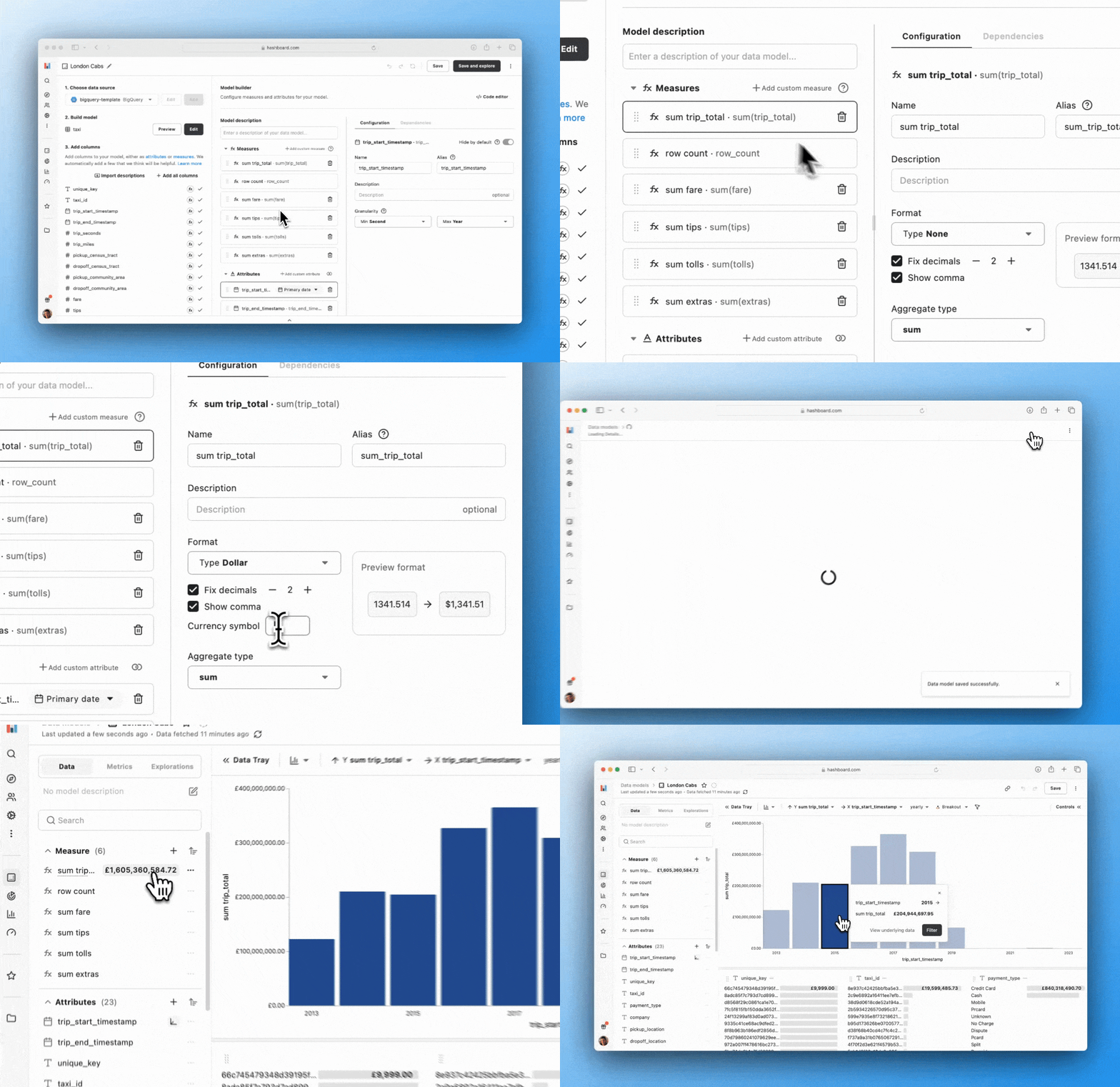
You can now use any currency symbol you want when reporting monetary amounts in your explorations. You can specify custom currency symbols in the model builder for your measures and after updating your model, the new currency prefix will be visible throughout your project's explorations, dashboards and metrics.
Edit models and dashboards with version history
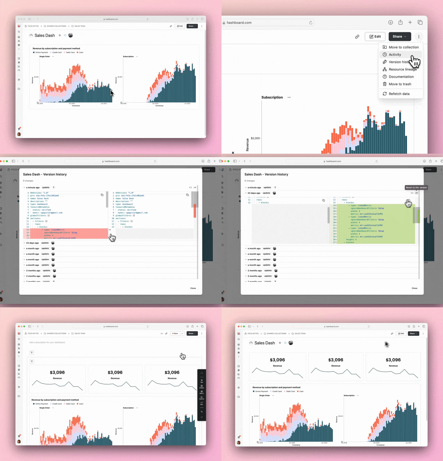
Have an older version of a dashboard or model you want to restore? We’ve made it easier than ever to bring back previous versions of your resources. From the version history modal in the model builder and dashboards page, you can click a single button to copy a historic configuration to your current configuration, make any changes you need, then save.
Introducing Hashquery: use your Hashboard models in Python code
See live examples and documentation at hashquery.dev
Logic shouldn't be trapped in any tool, especially not your BI tool. But data teams are often forced to choose between doing their modeling with proprietary DSLs like LookML or adding complex business logic into raw SQL, where it can't be easily re-used or extended. That's why we're building Hashquery.
Hashquery expressions are defined in Python, compiled into SQL, and run directly against your data warehouse.
It is capable of expressing complex, multi-layered data queries, way beyond the capabilities of standard SQL. It natively integrates with upstream semantic layers. And unlike a DSL, Hashquery is fully composable and extensible — it's just Python.
Improved Project Search (CMD+K)
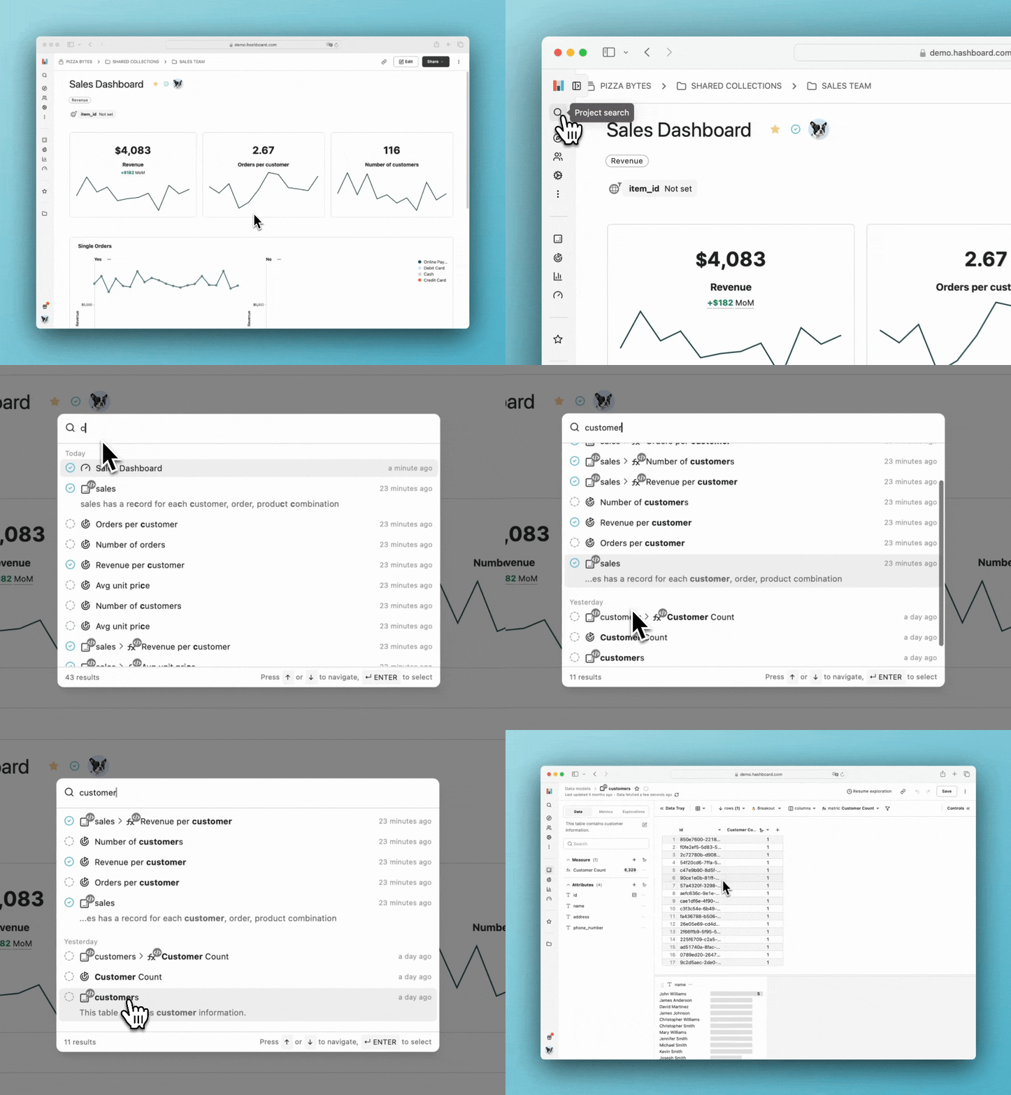
Project search is sporting an updated look to complement recent performance improvements that should make searching projects with hundreds or thousands of resources a breeze. In addition to all the project search features you're accustomed to, you can now see the status of each resource in the project search, making it easier to find the resource you are looking for.
Check out our documentation to learn more about project search.
Period-over-period Comparisons
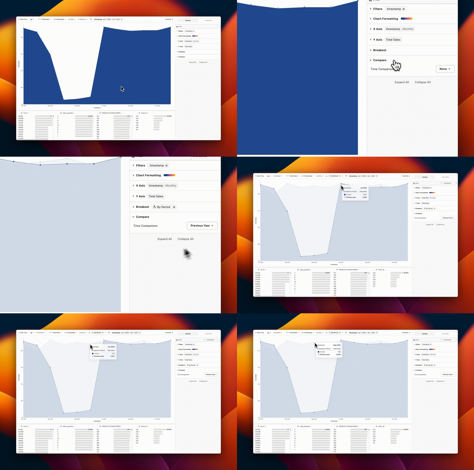
You can now compare data over time with Period-over-period comparisons!
They can be applied via the control panel on the right-hand side of the Data Explorer. Configuring a comparison will add a second series to your chart, labeled e.g. Previous Year.
Check out the docs for more info.
Table subtotals
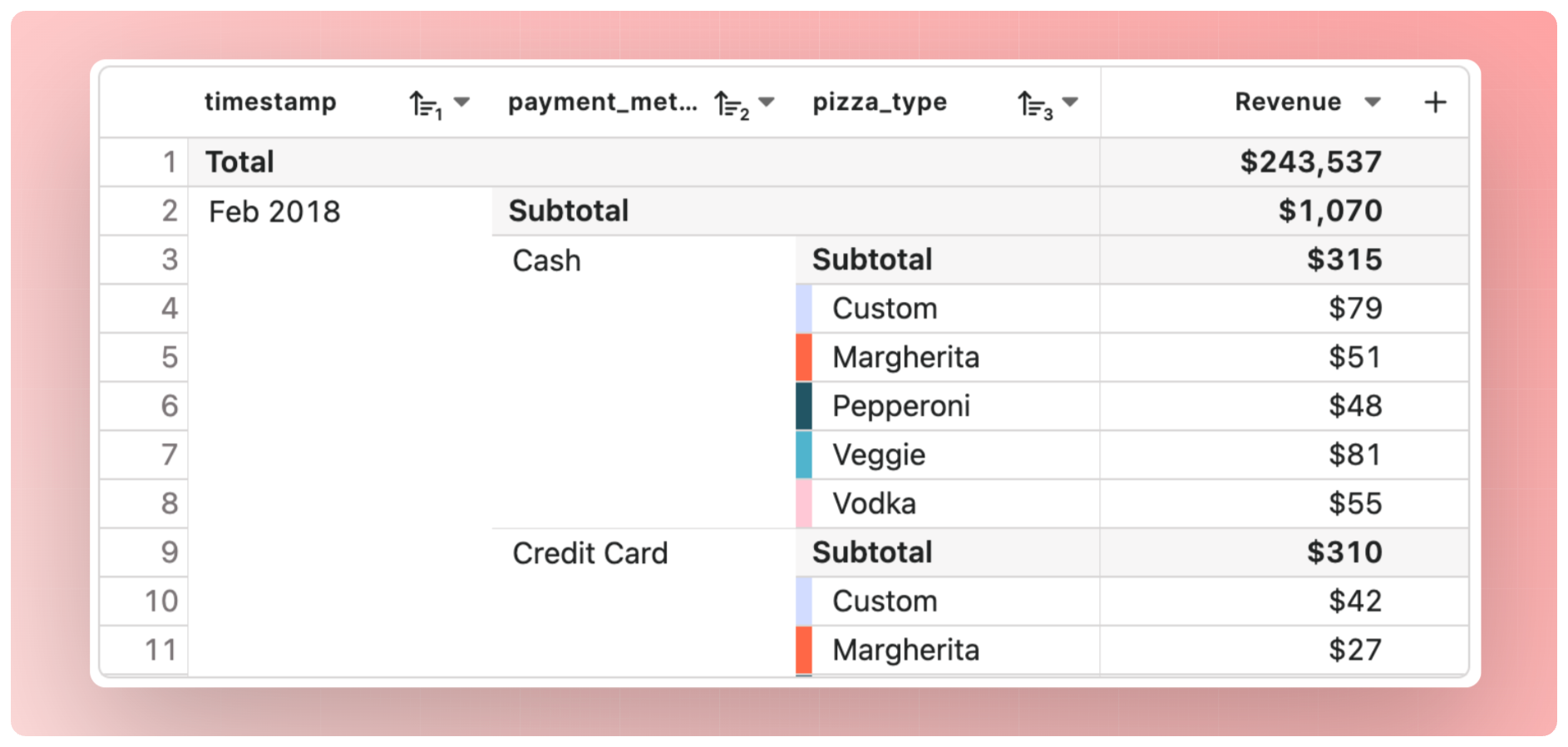
Use subtotals to see your key measures at all levels of aggregation! Subtotals are calculated at the database-level, so you’ll be able to generate subtotals for all your measures, such as unique counts and averages.
BigQuery Cost Analyzer 💸
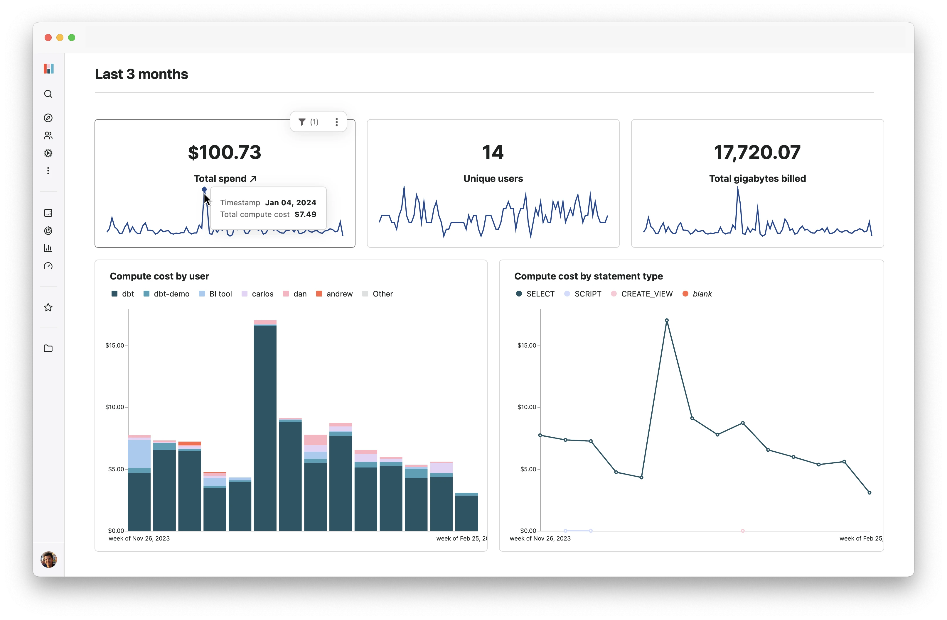
Save money on your BigQuery bill using our new BigQuery Cost Analyzer! In only 3 simple steps, Hashboard will create a new project populated with information about your project’s spending, users, tables, and queries, allowing you to dive deep into your usage, answer questions about which operations are the most expensive, and unlock insights on how to cut costs.
Try it out here.
Resource version histories
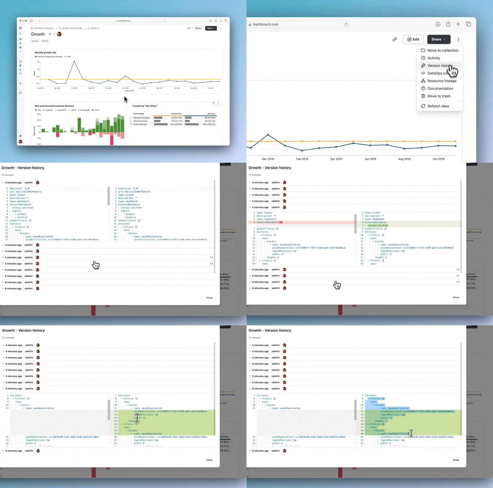
Dive into the past with our latest feature - history for project resources! Never again wonder whether a resource has changed or not. Now you can effortlessly track every change made to your data models, metrics, dashboards, and more. Visually inspect configuration changes with side-by-side diffs for individual resources or for your entire project.
Check out our documentation to learn more.
Query your data in Hashboard, anywhere
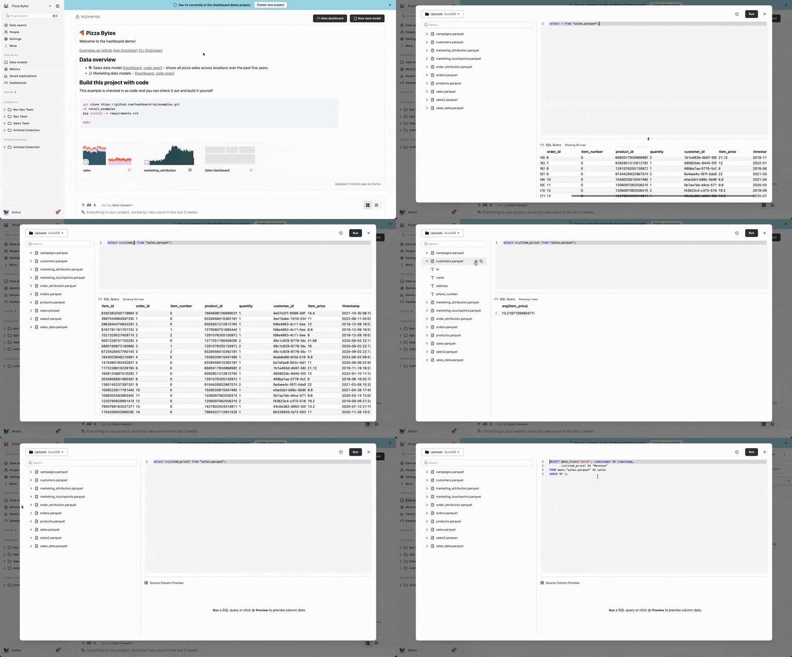
Need to run some quick SQL without leaving the page? Or just want to peek at the contents of one of your tables?
Then look no further! You can now run arbitrary SQL across any of your data sources with the SQL Runner. Just type Cmd+J (or Ctrl+J) to pull it up and start querying.
Pro tip: if you want to start with the underlying SQL backing any Hashboard exploration, click Open in SQL runner in an exploration's advanced menu at the top right.
For more information, check out the docs.
Databricks Integration
Databricks is our newest entry in our list of compatible data warehouses! Databricks is a flexible and powerful data analytics platform built on top of Apache Spark.
Check out our documentation to connect your Databricks SQL warehouse and get started exploring your Databricks data in Hashboard.
Explore Data with Adhoc Calculations & Attributes 🧪
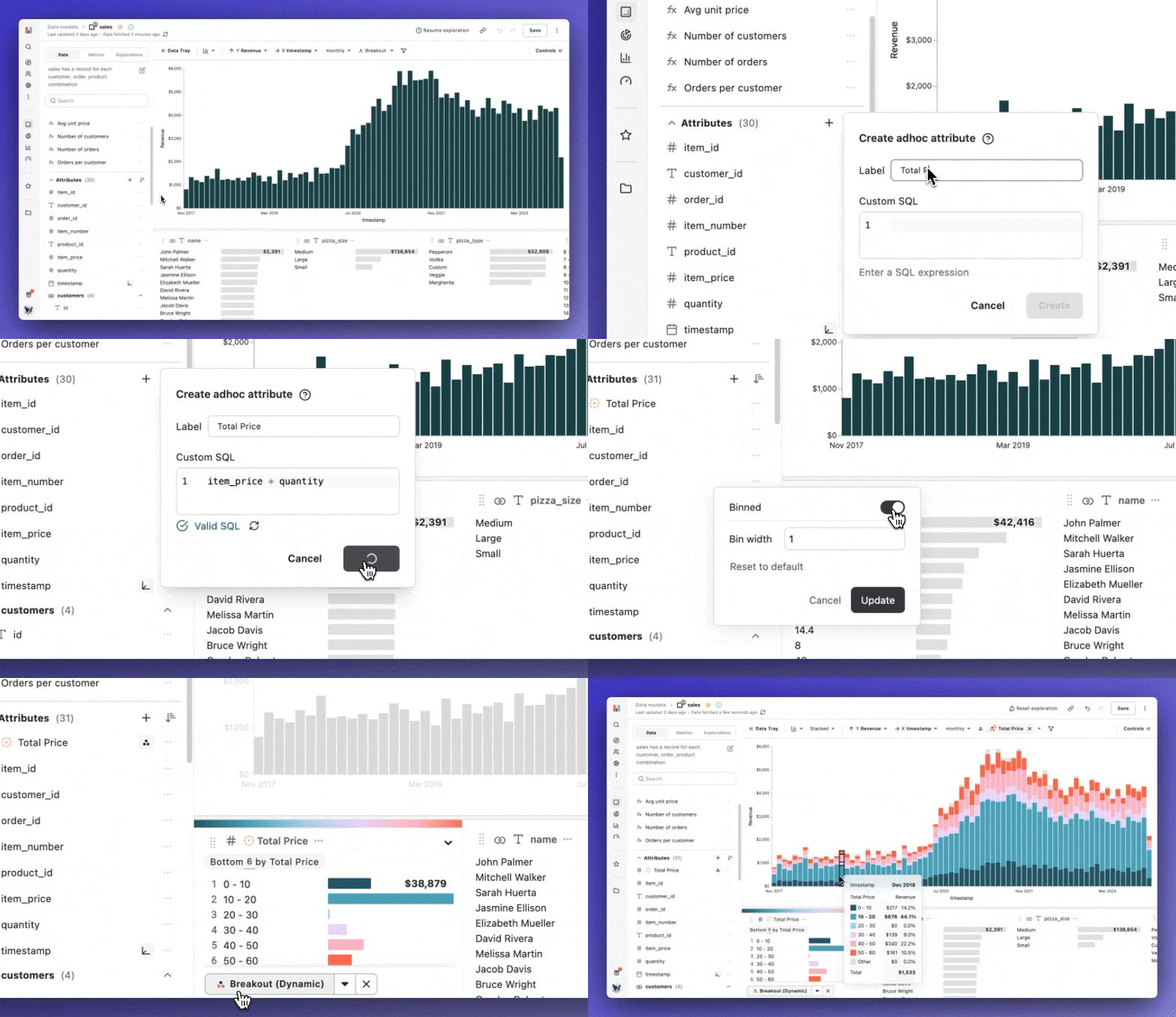
Explorations in Hashboard just got a lot more powerful!
You can now create adhoc attributes and measures within an Exploration. These can be used to breakout, filter, and measure by custom SQL snippets, on the fly!
You can create an adhoc attribute or measure via the data tray, by clicking the small + icon near the measures/attributes lists.
Check out the docs for more information.
In-app changelog
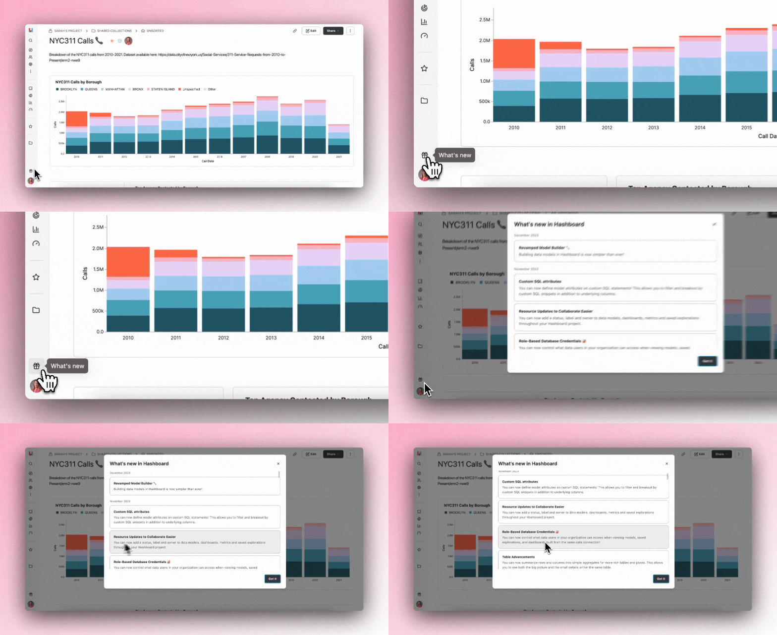
Our in-app changelog will notify you when we've released new features
Resource Activity
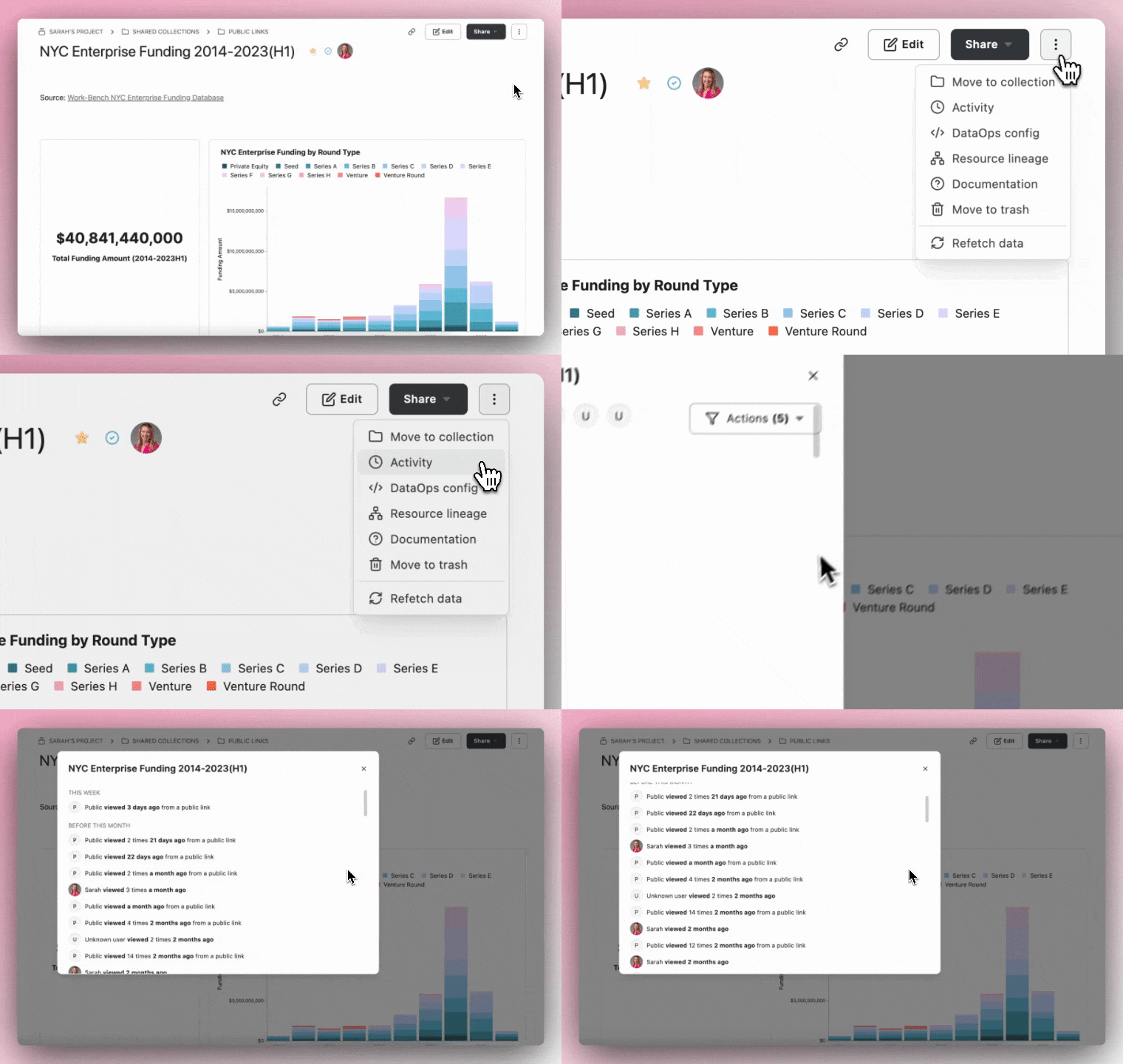
You can now see who's been interacting with a resource to make decisions around which resources to promote and which are safe to trash.
If a resource hasn't been viewed for a while, show an option to trash the resource from the Activity modal.
Multi-level columns and rows
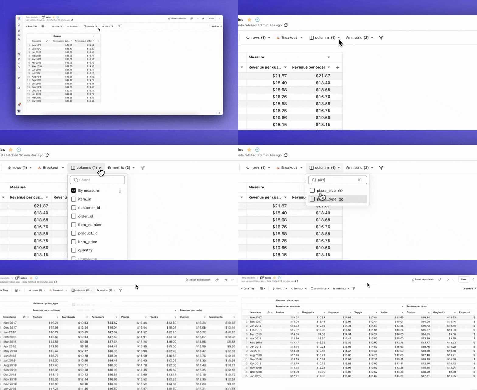
Tables can now do it all! Add multiple columns and rows to your Table charts to create multiple-level pivot tables. Go even further by adding multiple measures, cell formatting, and bar visualizations.
Revamped Model Builder 🔧
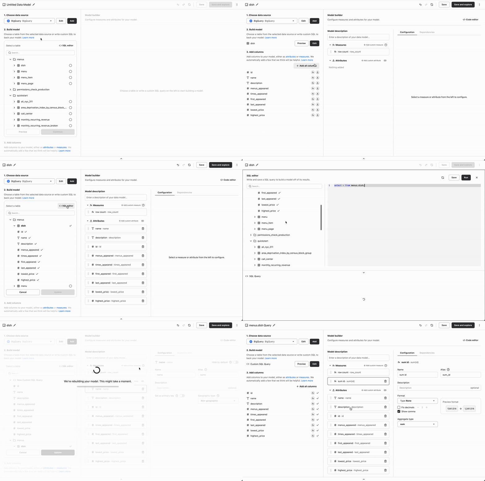
Building data models in Hashboard is now simpler than ever! Now, follow just 3 clear steps to create a model from the ground-up. Additionally, check out our brand new tables explorer and SQL editor that make the process even prettier and snappier.
Custom SQL attributes
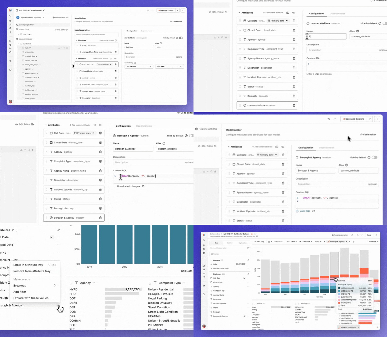
You can now define model attributes on custom SQL statements! This allows you to filter and breakout by custom SQL snippets in addition to underlying columns.
Resource Updates to Collaborate Easier
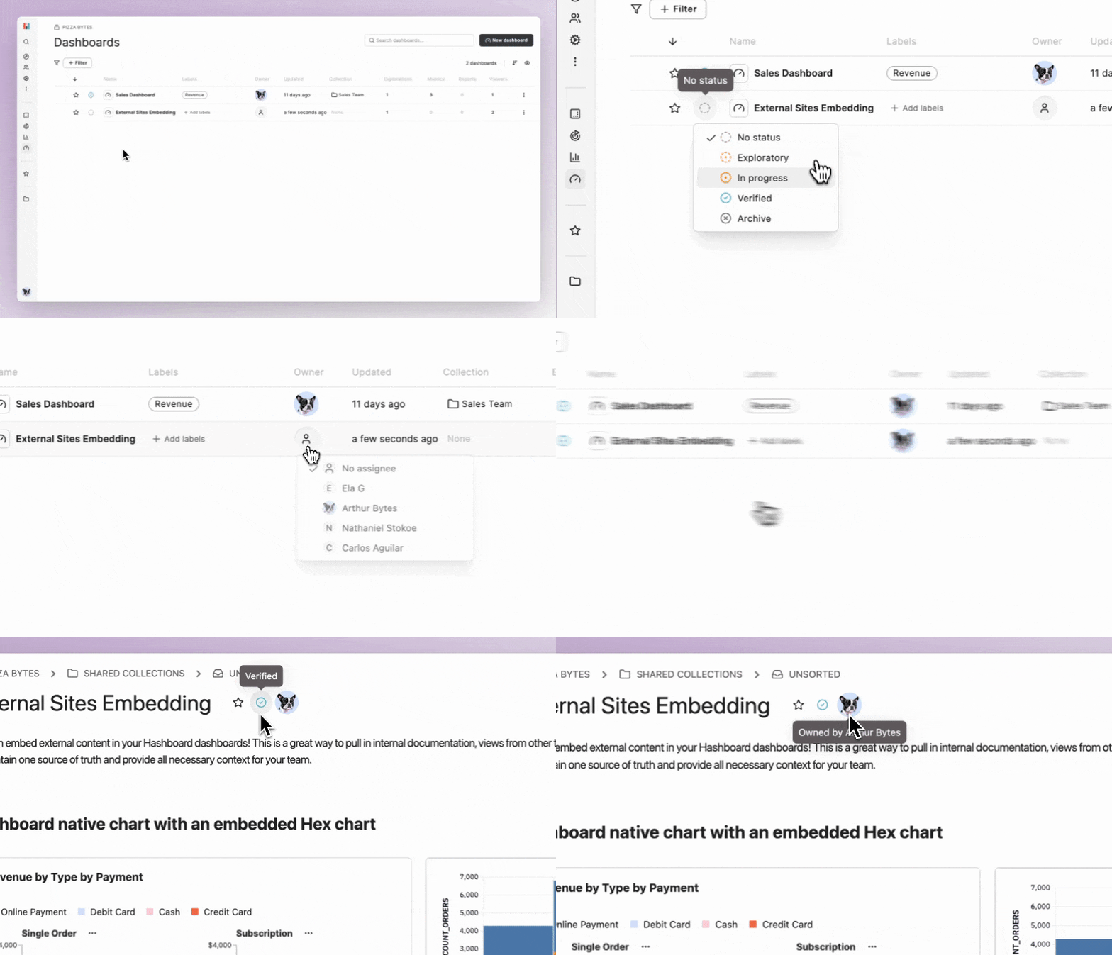
Three big updates have landed for project resources! You can now add a status, label and owner to data models, dashboards, metrics and saved explorations throughout your Hashboard project.
We added these features to help teams better collaborate and ensure that everyone is on the same page when building or viewing resources. Say goodbye to relying on other systems or pinging your data team to confirm resource statuses.
Role-Based Database Credentials 🔐
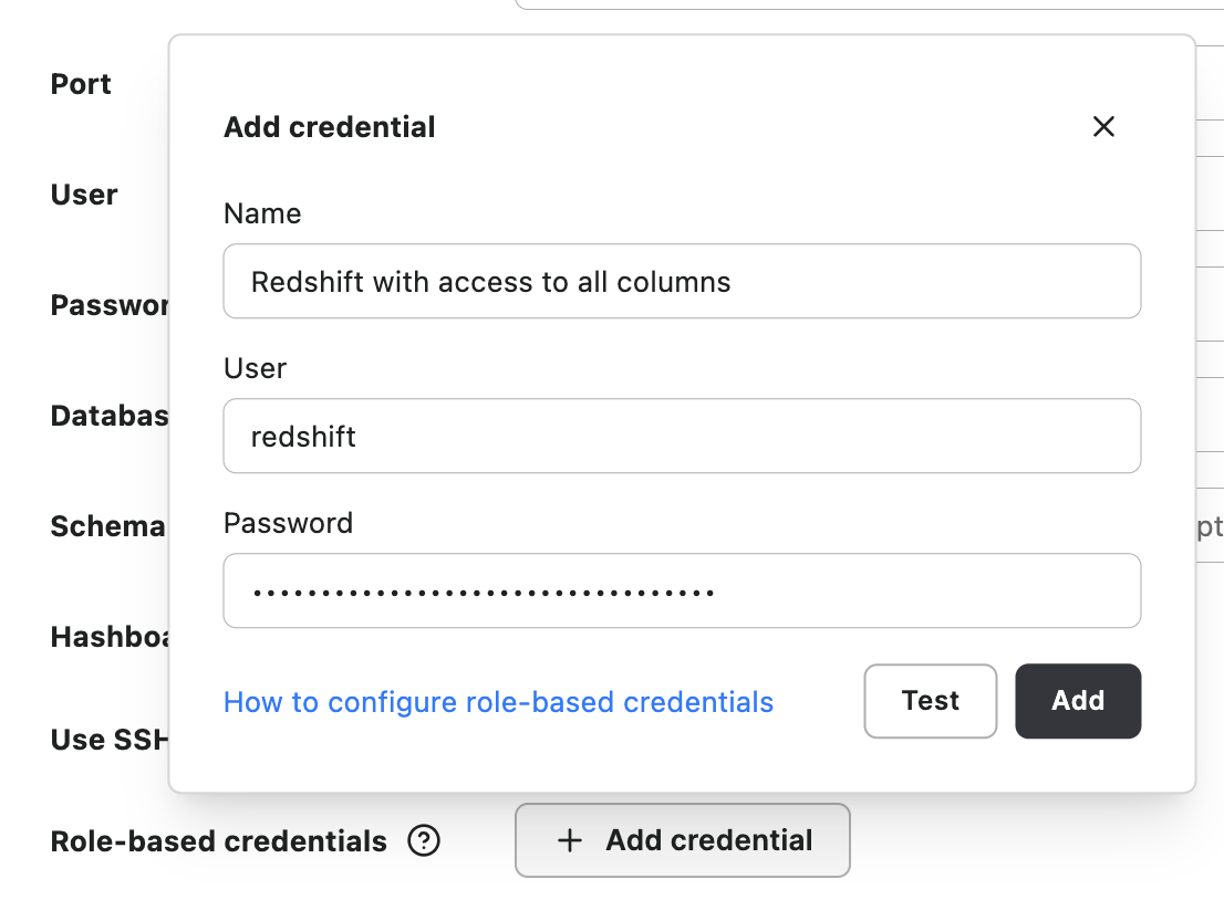
You can now control what data users in your organization can access when viewing models, saved explorations, and dashboards built from the same data connection!
Role-based credentials can be used to restrict access to certain tables, or even certain rows or columns within a table, based on a user's role. This is particularly helpful when dealing with sensitive data like PHI or PII.
All Hashboard data connections can be optionally configured to use additional credentials which can be assigned to users on a per-role basis. Let us know if you need help getting this set up in your project!
Table Advancements
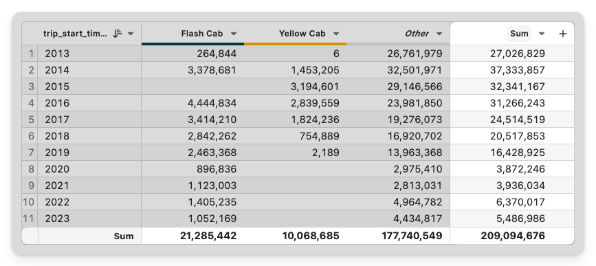
You can now summarize rows and columns into simple aggregates for more rich tables and pivots. This allows you to see both the big picture and the small details within the same table.
Dashboard Embeds
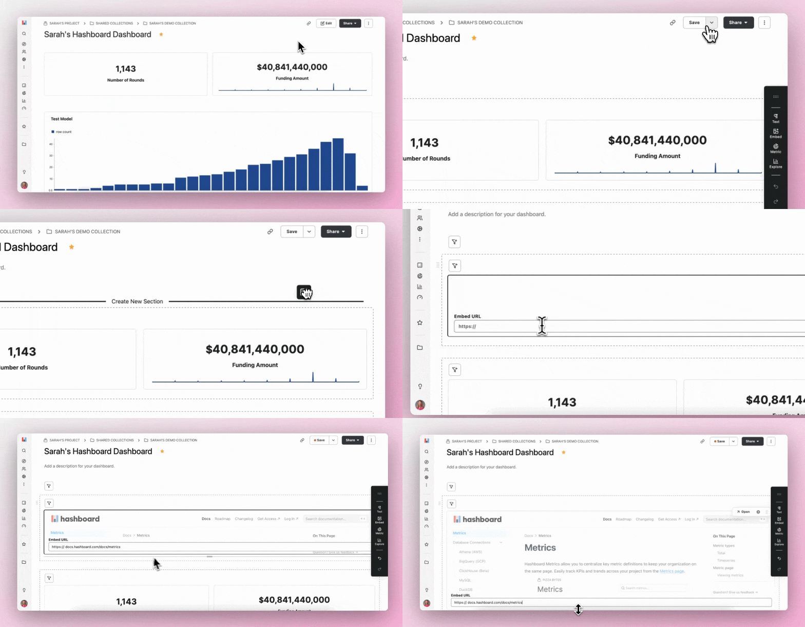
You can now embed external websites in your Hashboard dashboards (say that fast five times in a row)! To add external content in a dashboard, drag the embed icon from the toolbar onto your dashboard section of choice. Add a URL of the content, hit enter and you’re good to go!
We built this feature so users can link external documentation, walk through videos and more to provide their teams additional context and insights included on the dashboard.
Model Hopping 🐇
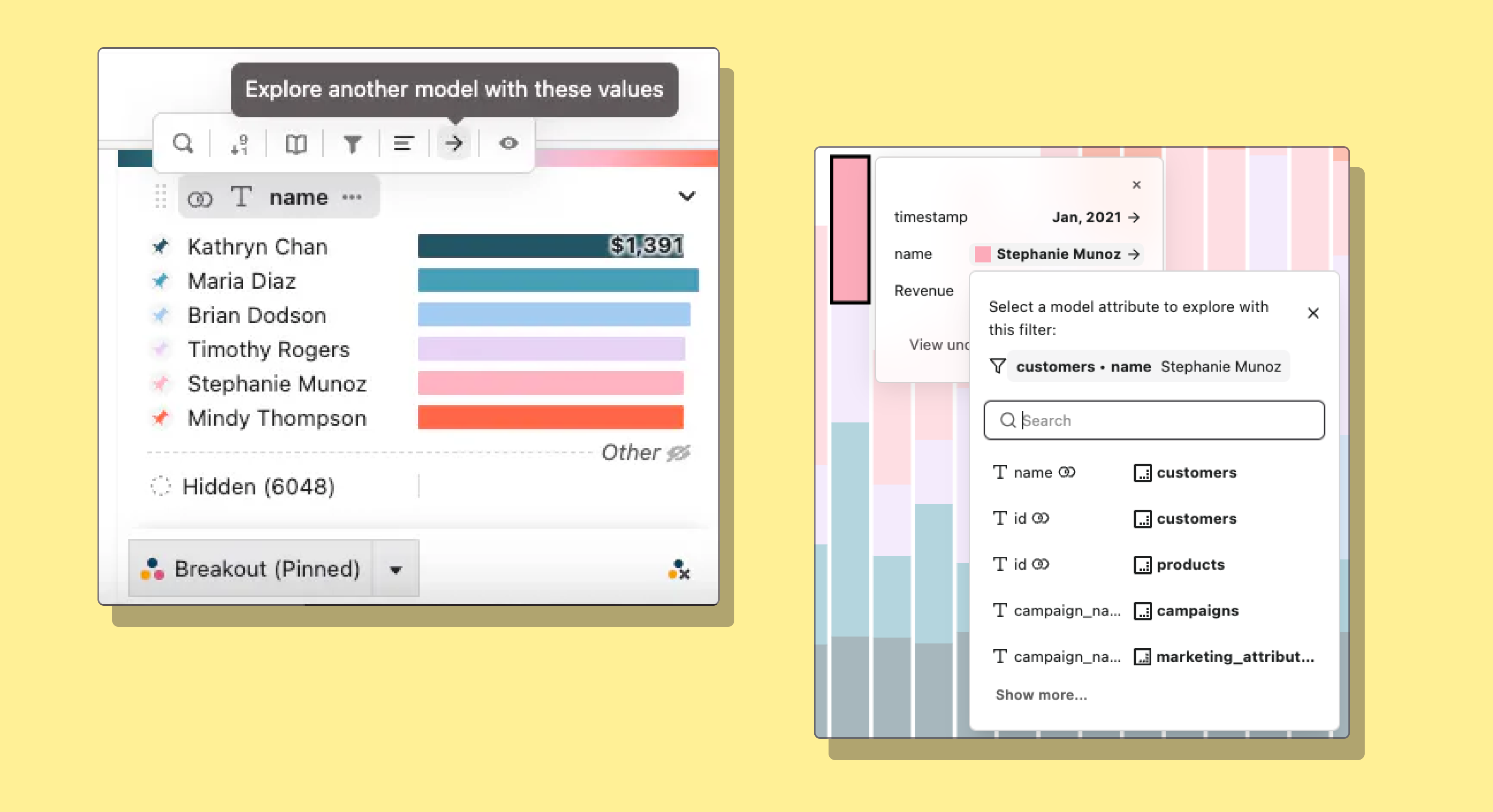
You can now easily explore and filter other models and data in your project by selecting the → icon in the attribute tray, from a tooltip or from the data tray. This will allow you to dive into a new exploration with a filter reflecting the current values automatically applied.
MotherDuck Integration
We added another database to our list of connectors! If you’re unfamiliar, MotherDuck is a collaborative serverless analytics platform based on DuckDB, an analytics engine optimized for online analytical processing (OLAP) on your personal machine.
If you require analyzing datasets across multiple external sources in a quick and cost-effective way, MotherDuck could be a great solution. Check out an example of how we analyzed 9 million healthcare insurance claims with MotherDuck and Hashboard. Looking for other connectors? Check out our full list of compatible databases here.
Create CLI access keys with hb token
If you already have a Hashboard account and want to start using hashboard-cli, run the following in a terminal:
pip install hashboard-cli && hb token
This will generate a new personal access key tied to your existing Hashboard project. To pull down the configuration files for resources you’ve already built in the UI, run the following:
hb pull --all
Now, you can enjoy a code-based workflow for building consistent charts. Just change these files, run hb preview and then hb deploy.
For more information, check out our CLI Quickstart guide.
Data Search 🔎
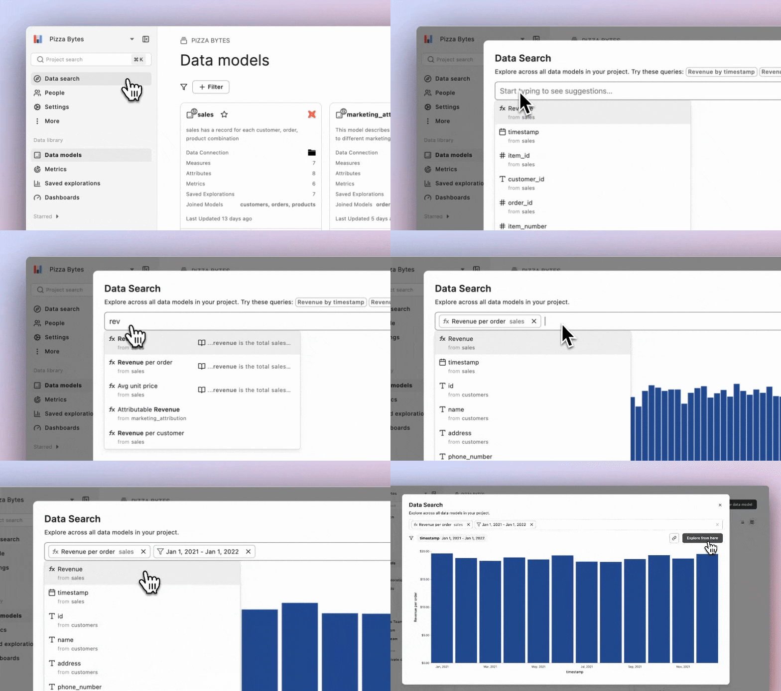
Discovering insights in your data is now even easier with Data Search! You can now search across all attributes and measures in your Hashboard project. Type in keywords and we’ll surface the most relevant matches.
Once you choose, either explore directly from the search results or share a link with your team. We take care of the details by filtering based on your previous selections and maintaining the relationships in your data defined by your project models.
Derived Measures
Custom measures can now refer to other measures to avoid duplicating logic. For instance, a Profit measure could be defined by {{ revenue }} - {{ costs }} deducting Costs from Revenue.
Metrics Page
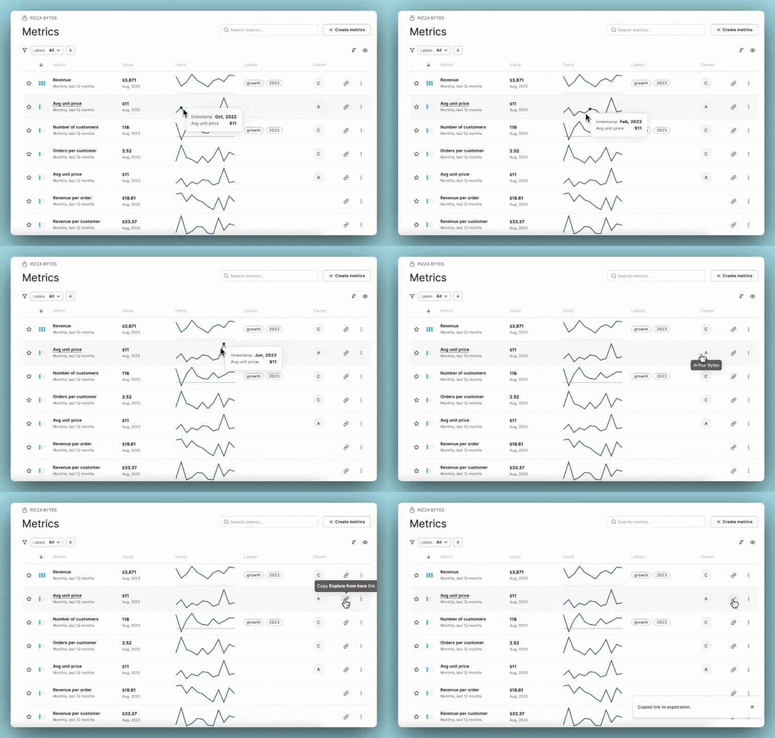
There is now one place in Hashboard to keep your team on track with company wide metrics!
Check out the Metrics Page in the data library on the left hand nav bar in Hashboard. Assign labels, owners and trend lines to each metric. As always you can explore and share with the click of a button.
Aliases
It’s now easier to reference your DataOps resources! You can assign models, saved explorations, dashboards, and color palettes their own project-wide unique aliases, which can be included anywhere you’d previously use their ID.
Introducing the Data Tray
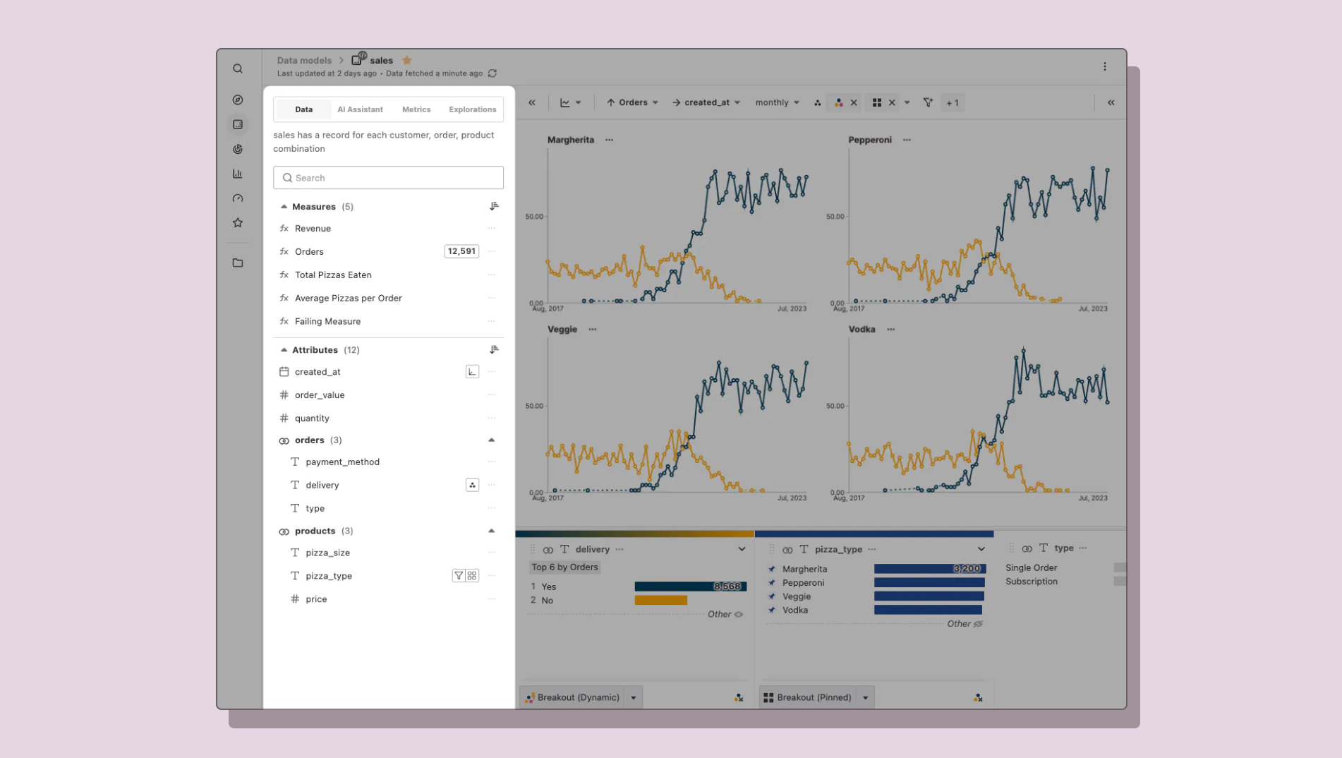
We’ve introduced a new approach to exploring data which makes it clear what data is available, and what actions you can take on each metric or attribute. This new interface should allow your curiosity to better guide you toward insights.
This is our first step in refining the data exploration experience to be clearer, faster, and (dare we say) fun-er.
JOIN us in a land of normalized data
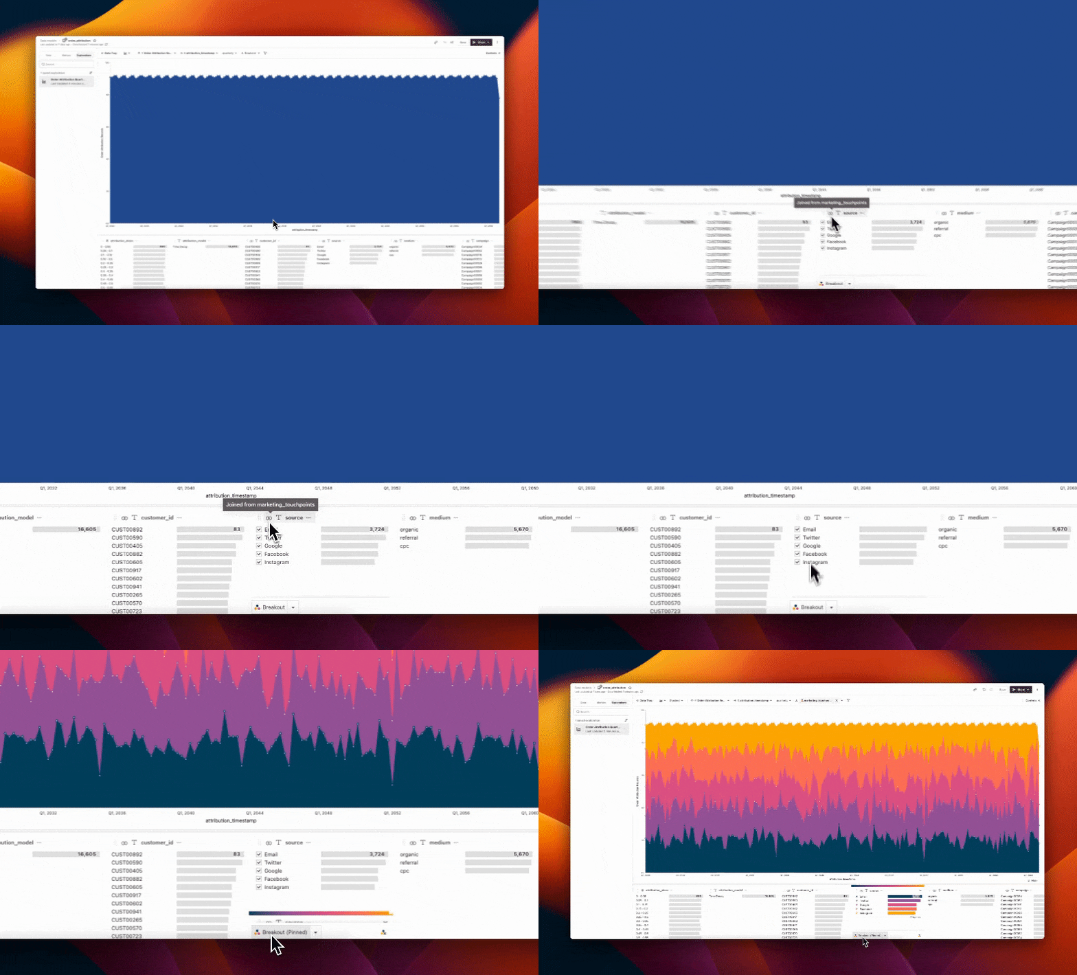
In the past, you’ve had to model data in Hashboard using flat, denormalized tables. While this can be a simple way to get started, it has its downsides. Now, you can model relational tables in Hashboard models directly.
Once you join models, Hashboard will automatically pull in relevant tables during queries, and allow you to use any attributes from any joined model. This gives you all the analytical flexibility of denormalized tables, and all the data tidiness of normalized data.
Measures
Rename alert! You may have noticed that what used to be referenced as ‘Metrics’ in data models and the data tray, have been renamed to 'Measures.’
Saved Explorations
Another rename and new functionality! 'Saved Views' are now 'Saved Explorations' to clarify what they are in Hashboard. All exploring happens on the model now. Saved explorations are read only, but can be the start of a new exploration with the new "Explore from here" button.
BI as Code Workflows 👩💻
Hashboard Pull - This command-line utility enables you to create and update DataOps configs from web-based resources. Confidently collaborate with your team in the UI, knowing everything is synced.
YAML Editor - Can you believe this feature has been around less than a year?! Use the editor to iterate on Hashboard resources as code and see changes in real time.
Collaboration Features 🤝
Slack - Schedule automated reports to keep your team up to date and engaged with important metrics. Share saved explorations and dashboards with added notes and context.
Public Links - Showcase and share your data, view-only, with others on the public internet. No authentication required to view saved explorations, dashboards and collections.
Description Syncing - If you’ve already written docs in dbt or directly in your dwh, we’ll take care of the rest! Descriptions will be automatically imported when you create a Data Model, or add new attributes to it.
Integrations 🖇️
DuckDB - No data warehouse, no problem! Upload json, csv and parquet files into Hashboard and start visualizing your smaller datasets.
ClickHouse - Another great data source option to connect to Hashboard when you’re working with larger datasets.
dbt - Build on top of your dbt files and Hashboard will automatically keep your resources in sync. Make changes to your dbt schema while identifying issues in downstream visualizations and dashboards, sync docs and more!
New Charts & Visualization Types 😍
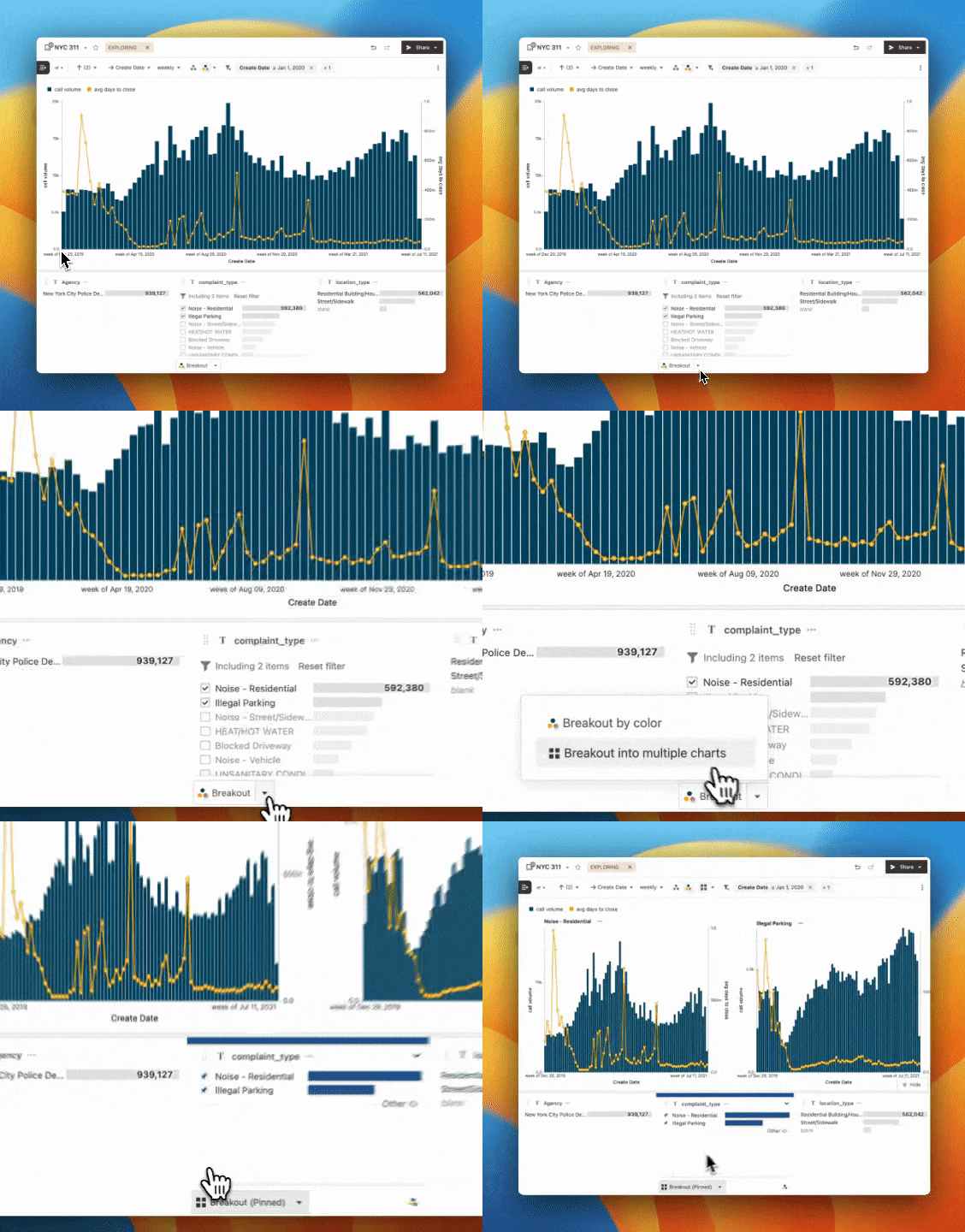
Bar + Line, Multiple Axes, Trellis and More** - Choose from bars, areas and lines to layer on top of each other in the same chart. You can also display measures on different axes and scales, all from the control panel. Explore the data above yourself here!
Transpose Tables - The control panel is full of data viz goodies, including the toggle for transpose tables. Switch the positions of your rows and measures by switching this on.
Dynamic Breakouts - This upgrade to the breakout feature makes it super easy to always look at the most relevant data. Define criteria that adapts your breakout as your data changes.
Row Numbers on Tables
This one is pretty self-explanatory 🙂 every table-based visualization in Hashboard now has row numbers!
Text Datasets
If you’re analyzing datasets containing long blocks of text in Hashboard, you may have run into limitations. You can now double click on the cells in the underlying data view to see all of the text in a scrollable view.
Bar + Line Charts…and more!
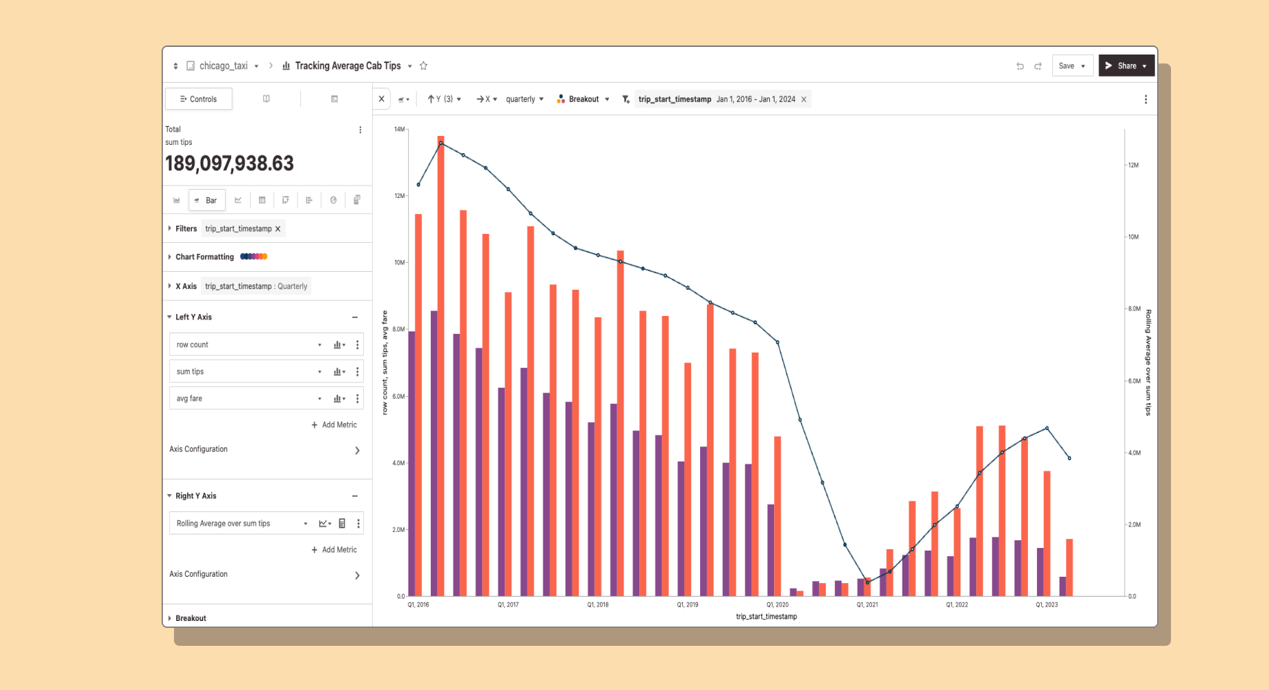
You’re now able to configure different mark types for each measure in Hashboard! Choose from bars, areas, and lines to layer on top of each other in the same chart. Mixing mark types can help easily visually distinguish different types of measures. For example, you can use bars for measures that represent quantities, and lines on the same chart to show trends over time.
There’s more! You can also display measures on different axes and scales. With this feature, you can easily compare different measures by adding a secondary y-axis into your views. This is particularly valuable when dealing with datasets that have significantly different ranges or units of measurement.
You can customize each y-axis by adjusting their scales and ranges individually in the lefthand Control Panel. Combine these two features for highly customized, powerful charts.
ClickHouse + Hashboard
Our latest integration has arrived! Hashboard now supports Clickhouse as a data source, check out the details and get set up today.
Documentation Synced from dbt and your Warehouse
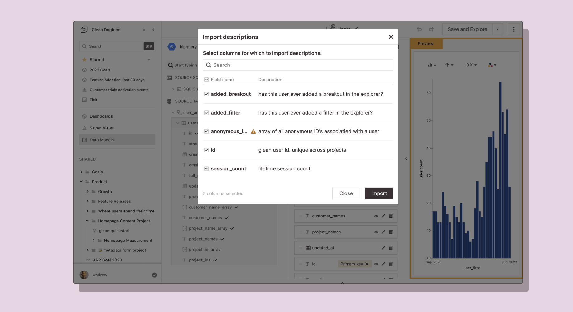
Description syncing is going to make your life so much easier! If you’ve already written your docs in dbt or directly in Snowflake or Redshift, we’ll take care of the rest.
Hashboard will automatically import those descriptions when you create a Data Model or add new Attributes to it. You’ll always be able to keep your descriptions up to date with the Import Descriptions feature when the descriptions in your table change. Start syncing today!
Filter and Group Array Values
Say hello to array attributes! Hashboard now natively handles analyzing array types from a model. You can filter and group array elements while preserving your original measures, attributes and calculations.
Let’s say you have a Hashboard model for marketing campaigns. Each campaign has multiple ‘tags’ that you wanted to analyze: (eg. ‘drip campaign 2’ and ‘enterprise customer’). Previously you’d have to create a new model to analyze the tags instead of being able to analyze them with your original campaigns model. Array attributes let you analyze all your campaign metrics consistently across the multiple tags. So you can view performance for your ‘enterprise customers’ compared to your ‘drip campaign 2,’ even though they are overlapping.
Improved DataOps Workflow with Hashboard Pull
Our team is continuing to invest in DataOps so you can easily manage all of your Hashboard resources in code.
The latest release, Hashboard Pull, is a command-line utility to create and update DataOps configs from web-based resources. Use the Hashboard web interface to collaboratively improve your data models and visualizations, then use Hashboard Pull to keep your DataOps synced.
SQL Editor Improvements
You can now run a partial highlighted query from the SQL editor by highlighting and cmd + enter!
Custom Start of Week Configuration
We’ve started rolling out more advanced time-based configurations. You can now configure a custom start of week so reporting can start on either Monday or Sunday.
Dashboard Exploration Links
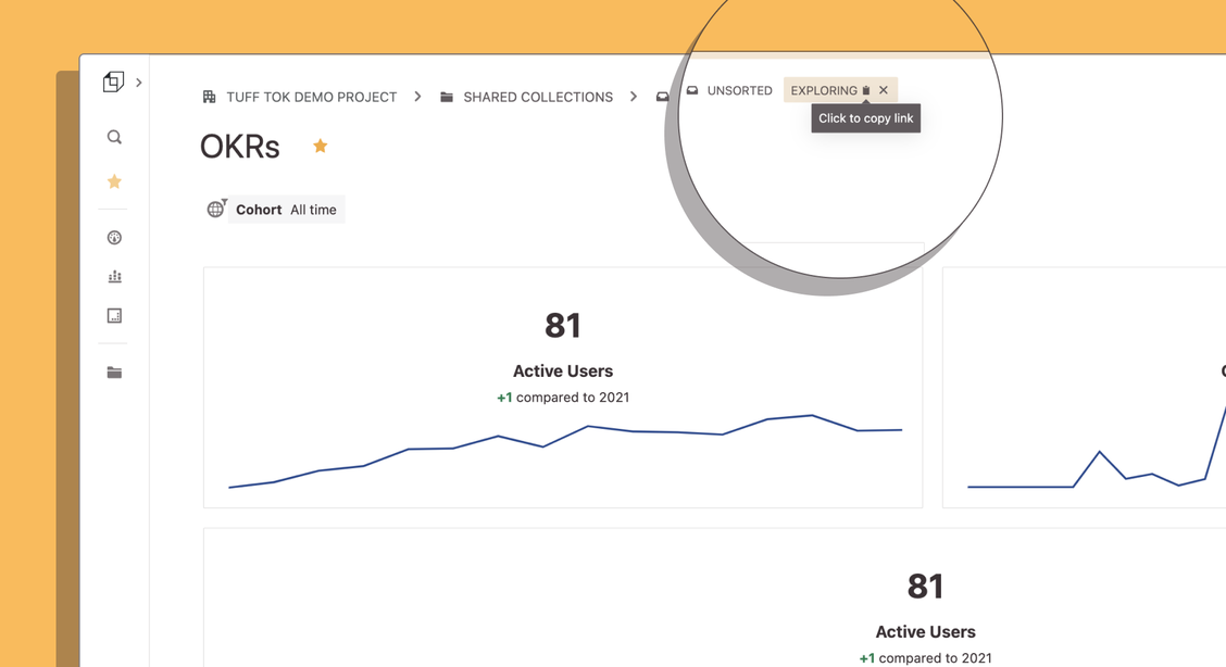
Have you ever filtered a dashboard and found an astonishing insight you wanted to quickly share with your team? Hashboard now automatically creates a Dashboard Explore Link every time you interact with a dashboard, making sharing a URL to your insight a breeze.
Explore Links now work the same across Dashboards, Saved Explorations and Data Models.
Public Link Sharing
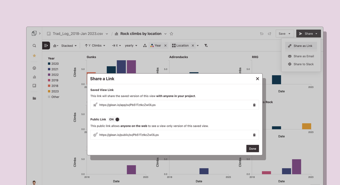
We heard your requests for this one! You can now create publicly-accessible links for Saved Explorations, Dashboards and Collections. Click the ‘share’ button on the top right of any resource and select “Share a Link”.
Share these with external stakeholders to show them your data in Hashboard. Public Links let you safely share specific cuts of your data and don’t allow recipients to view underlying data or change filters.
Collections are shared in presentation mode as a slide deck.
PS - If you’re not quite ready to share Hashboard views publicly, you can choose to embed authenticated Data Models, Saved Explorations and Dashboards in external applications.
Refreshed Control Panel
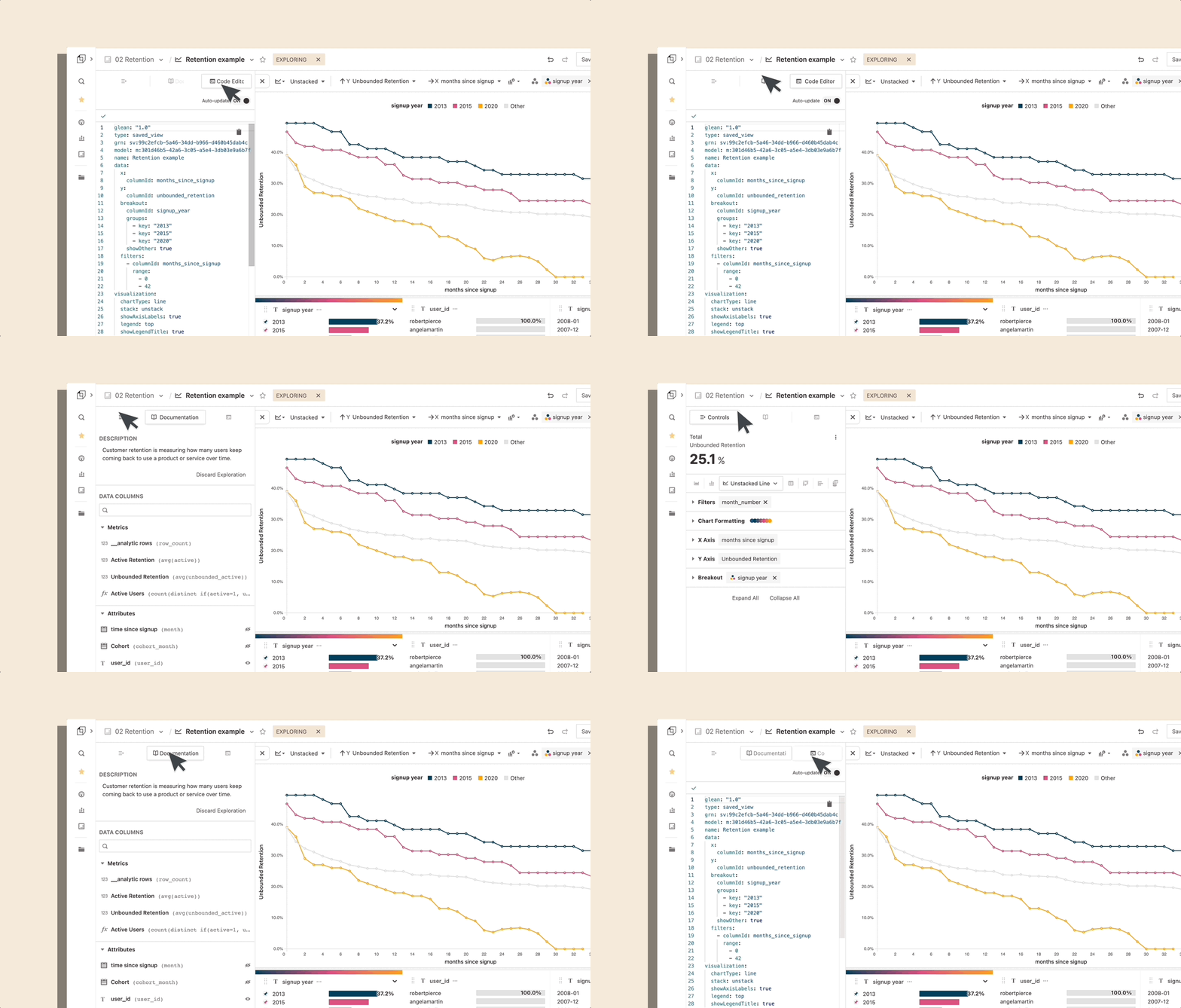
We’ve redesigned the controls for building advanced visualizations in Hashboard!
Not only did the panel get a fresh coat of paint, but all of the controls are now organized for more advanced chart options. You can easily reconfigure charts, add documentation and jump into the code editor all from one place.
🔒 Controlled by DataOps
You can now protect specific resources to only be editable with DataOps. Set this flag in the YAML to ensure your resource configurations always match the configurations that you’ve defined in your repo. Read all the details here
We also separated Deploys from Previews in DataOps, making it easier to find the builds that have applied changes to your project.
Resource Descriptions
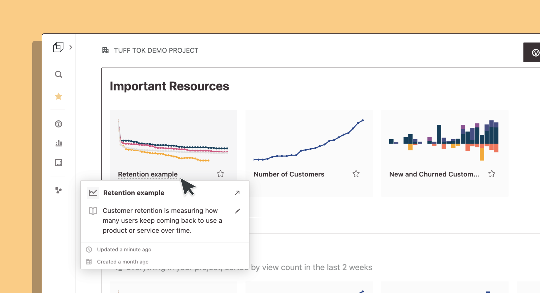
Documentation is hard. We get it 😅
Good news for you is that the descriptions you’ve written now appear throughout Hashboard. Hovering on a resource name reveals a card with more information about a resource including when it was created and a description. Documentation just got easier too, you can quickly update the documentation right from this card!
Sharing Reports from Hashboard
Sending your favorite Hashboard reports to your stakeholders just got easier! Now editors and collaborators can share email and Slack reports by default.
Transpose Tables!
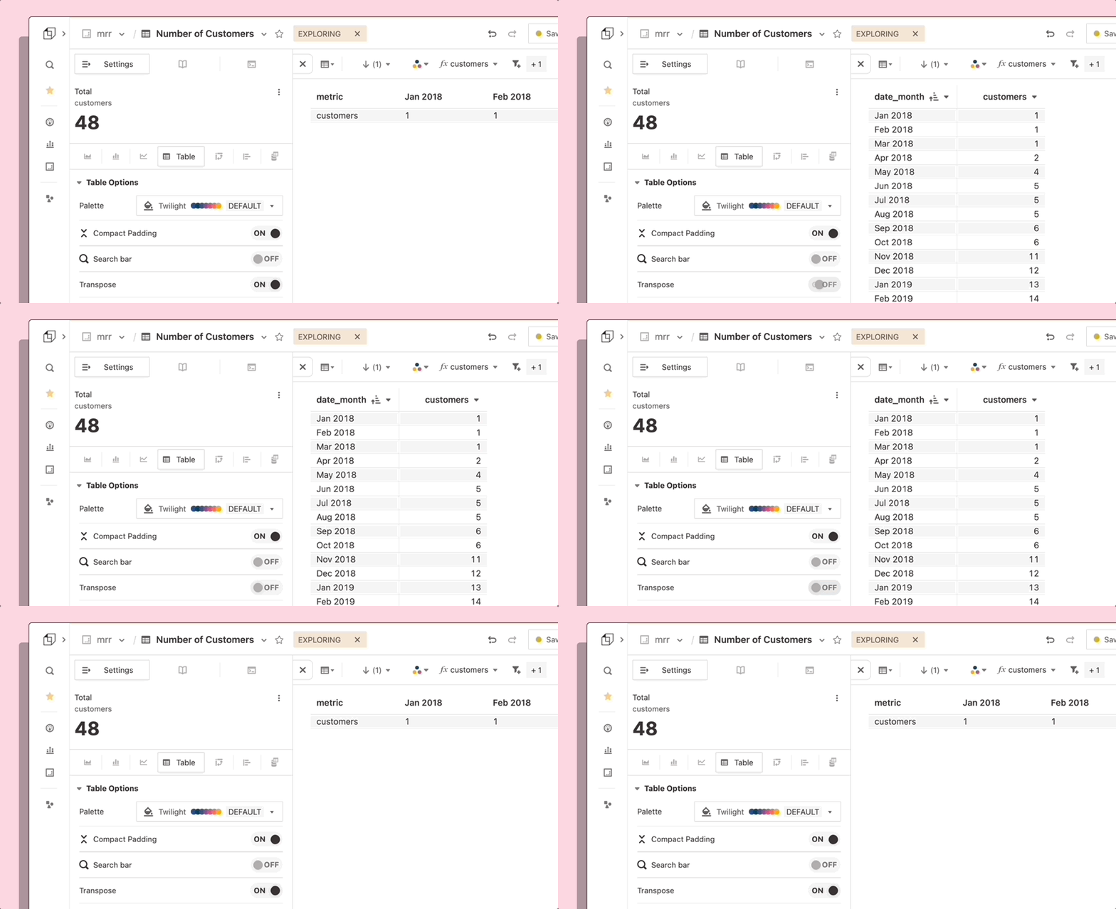
We heard your feedback on this one! Transpose Tables are officially live in Hashboard 🎉 You can now switch the positions of your rows and measures by toggling Transpose in the Control Panel.
We started small with this feature that allows you to essentially turn the table by 90 degrees. We’re hard at work on more flexible pivot table configurations where you’ll be able to set both multiple row and column attributes. Check out our product roadmap to see what else we're planning on building!
DataOps Live Recap
Thanks to everyone who joined us last week for a live demo of Hashboard’s DataOps ! If you missed it, check out the replay and slides here.
📣 Let us know what you would like to see next time!
Deep Search for Measures with CMD + K
In addition to searching the names of your resources, Hashboard search (always available with shortcut CMD+K) now surfaces the names of the measures defined in your data models.
You can jump right into a new exploration with that measure already selected! Resource descriptions are also now searchable, making it easier to find what you're looking for when you can't remember a resource's name.
Dynamic Breakouts
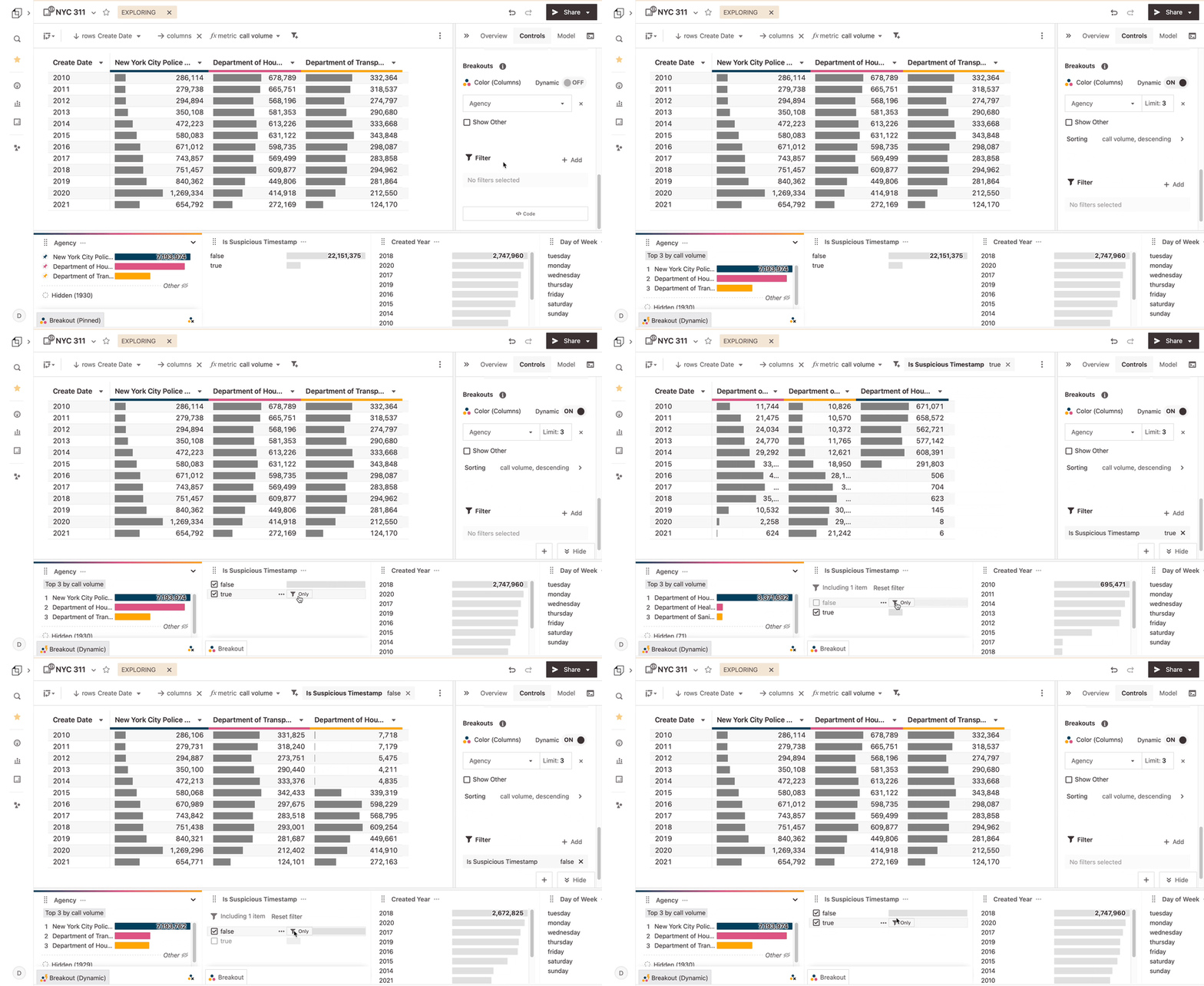
Breakouts in Hashboard have always allowed you to pick a set of attributes to track. For example, you can breakout seven customers that are particularly important and track their product usage. Breakouts keep comparison sets manageable and charts looking good. This is a core Hashboard feature which we love!
With the addition of ⚡️ Dynamic Breakouts, you can now define criteria that adapts your breakout as your data changes. For example, you could always track the top 20 revenue customers, or you could track the six most recent cohort months.
Dynamic Breakouts allow you to always look at the most relevant data in an easy-to-digest way. Here’s an example in our demo site: this retention curve will always look at the three most recent years in the data and group all the other years together.
Metric Tiles
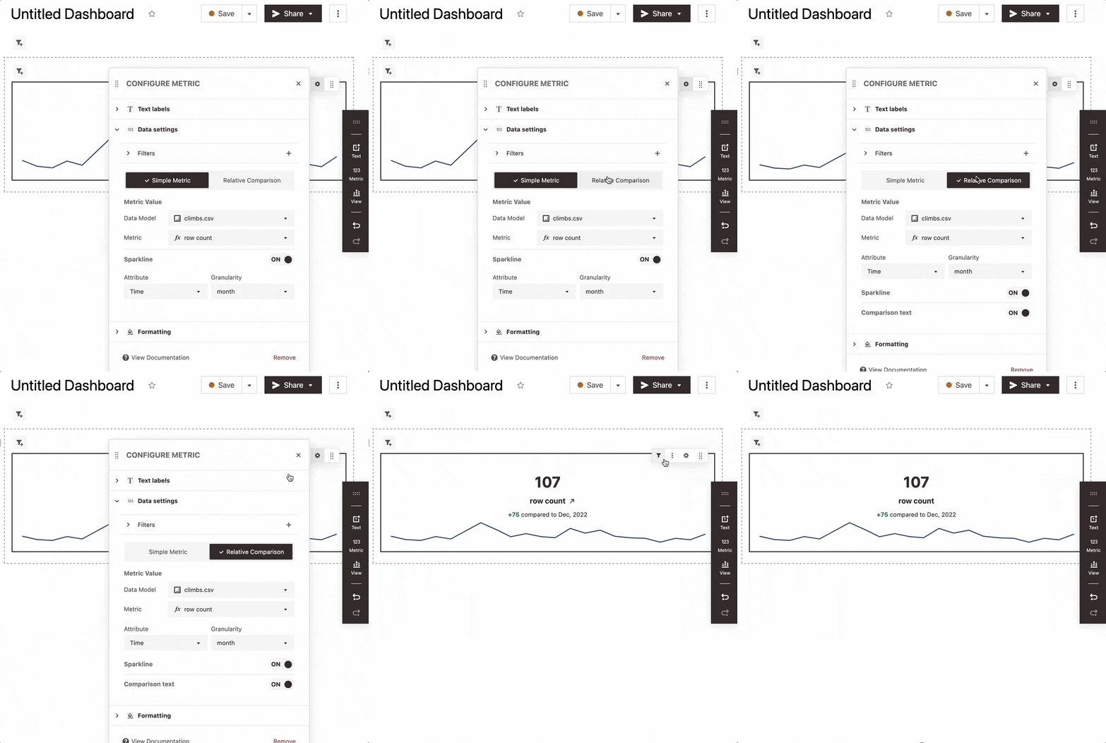
We’ve added several enhancements to our dashboard Metric Tiles! You can now easily monitor key metrics with sparklines and comparisons. Your team can now get a comprehensive sense of how all of your metrics are performing at a glance.
You can also configure tiles to display the latest value instead of the total. For example, you can show yesterday’s user count instead of total user count. Read more in our docs.
Customize Your Hashboard Homepage
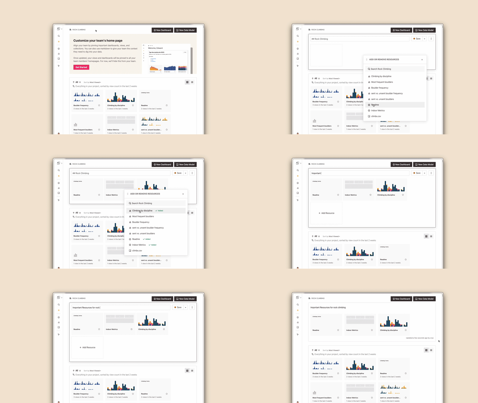
Ensure everyone in your company knows which resources to start with and why. You can now pin the most important resources for everyone at the top of your project homepage with a description to explain the context. We also support markdown to make it beautiful.✨ Additional details in our docs here.
Improved DataOps Build Summaries
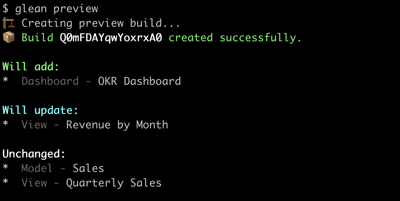
A much-requested feature! Hashboard now indicates whether your resources are “changed” or “unchanged” when creating Preview or Deploy builds. During each build, we compare the configuration of each resource with the version that is currently deployed to your project and indicate whether there are any differences. You can use this to confirm that your build is working as intended, or to detect unwanted drift between your project and your configurations in Git. This is now live for both the Hashboard web UI and the CLI.
Reorder Starred Resources
Your favorite resources in Hashboard are now displayed in the left hand panel. Easily drag and drop them to adjust order. 🌟
Sandbox Demo Projects
Sandbox demo projects have the full functionality of Hashboard with preloaded datasets for you and your team! These projects are a great place to train team members on Hashboard or try the product out without connecting your own data warehouse. We highly recommend using them to experiment with our DataOps Examples without disrupting your project! Easily set up a sandbox project today in a couple steps.
SSO is here! 🔒
You can now connect Hashboard to Okta, or any SAML or OIDC provider of your choice for a seamless login experience! With single sign-on (SSO) enabled, admin users in your identity provider can control which users or groups have access to Hashboard. Through SCIM, you can not only add and remove Hashboard users, but also manage their custom Hashboard roles directly in your identity provider. If you’re interested in setting this up for your organization, reach out to our team to learn more.
[Beta] YAML Editor
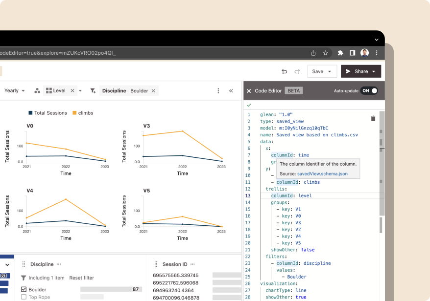
Advanced users can now directly edit models and saved explorations as code with our in-browser YAML editor, now in beta. Iterate quickly on your DataOps configurations with real-time updating and built-in autocompletion.
Public Demo Site
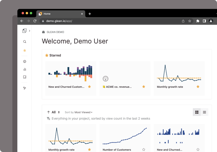
We launched a public demo site to show off example use cases in Hashboard! Check out the current examples for retention and subscription businesses; we’ll be adding additional examples over time.
Slack 🤝 Hashboard

Share all of your favorite data visualizations from Hashboard straight to your Slack channels! Set it up today here.
Upload CSVs into Hashboard
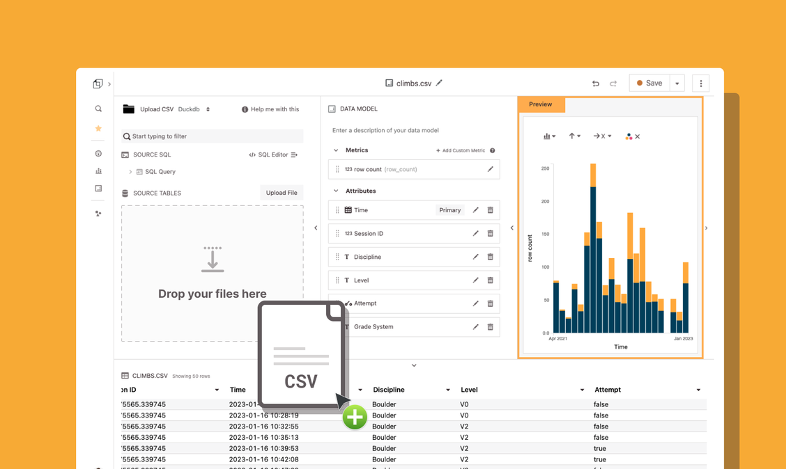
The time has come - you can now upload a CSV file and query it in Hashboard like any other table using DuckDB! Write custom queries, joins and update the data. We also support JSON and Parquet files.
Filter on measures
Measures filters allow you to surface the most important data points in your tables. You can filter to customers with a certain number of active users, or filter to tests that are failing above 95% of the time. You can also use measure filters as alerts: schedule a report to only send when there are tests that are failing above your 95% threshold. Then you can schedule an email (and soon Slack) report to trigger when tests.
Get your team into Hashboard with Access Domains
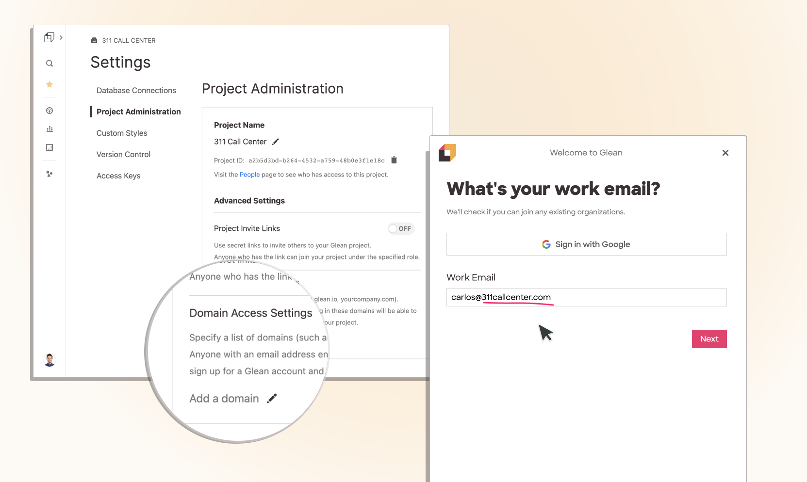
No more velvet rope - your whole team can access your Hashboard project by configuring your organization’s email domain. Go to the settings page in your project and configure your organizations domain (e.g. yourcompany.com) as an Access Domain to automatically let people with valid emails into your project.
Resource Lineage
If you’ve ever wanted to quickly edit a measures definition from a dashboard, or see which dashboards a model is being used in - then the new Resource Lineage has your back! Click the carat next to any resource and select Resource Lineage. This works for Saved Exploration, Data Models and Dashboards - a quick visualization will show all of the other upstream and downstream dependencies.
Restore deleted resources from the Trash
Your project now has a Trash where you can recover deleted items. We hope this makes cleaning up your project easier and safer. You can delete and restore entire collections of resources or individual resources. You can still view and interact with items in the trash but they won’t show up in your collections or in search. Check out the new trash page in your project.
Automatically add teammates with Invite Links
You can generate a secret invite link through your settings page that allows your teammates to join your project automatically. You can now avoid having to manually add the email address of each teammate individually, which was painful for large projects.
Custom Color Palettes
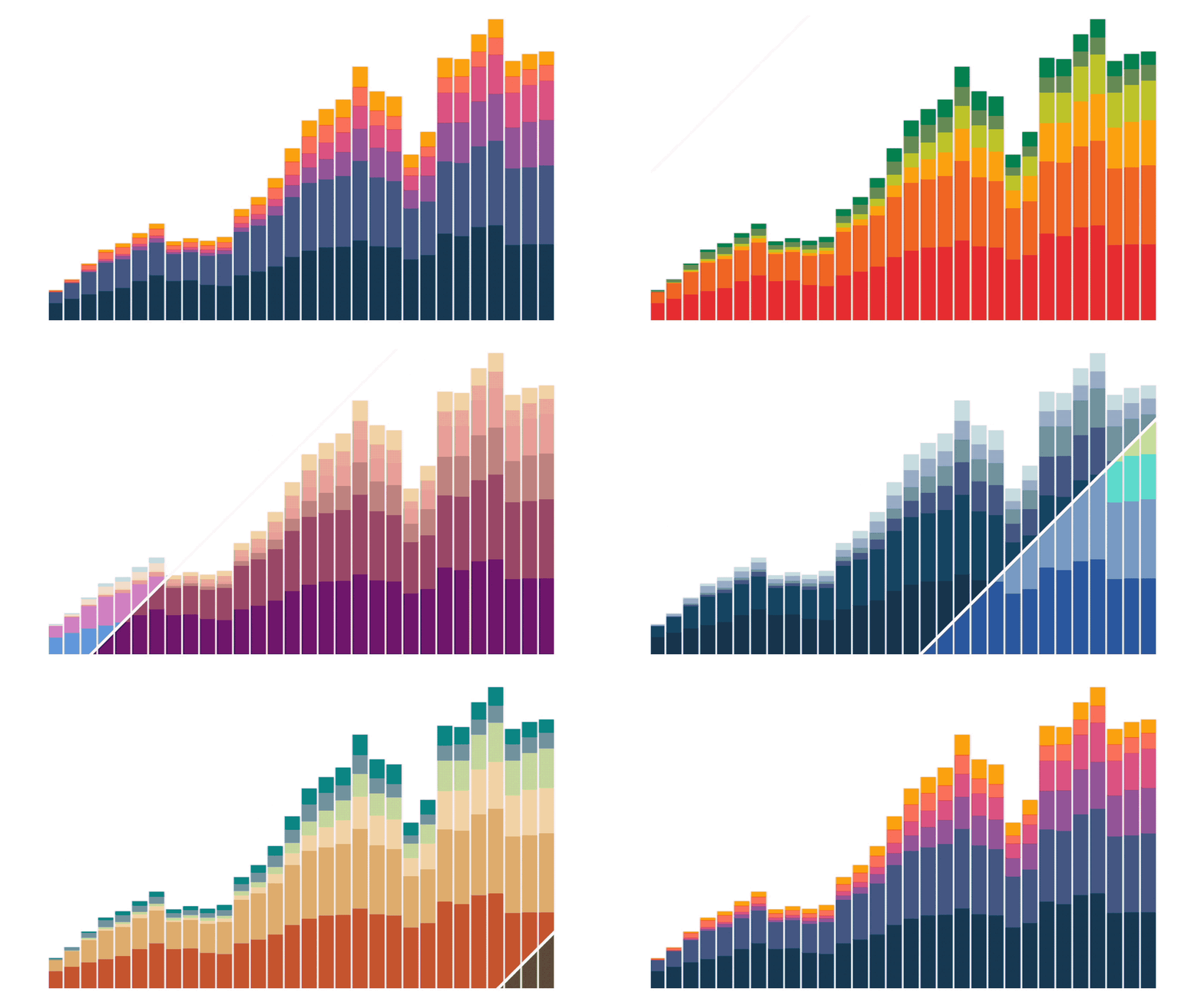
You can now add customized color palettes to your project and use them in any chart. Head over to the settings page to add new palettes or use DataOps to configure palettes with code. Use a custom color palette for a specific exploration to tell a more effective data story - like using green for increases and red for decreases in revenue.
You can also override Hashboard’s default color palette to make your project feel tailored to your organization. Your default palette will automatically be applied to every chart in your project that doesn’t have different custom colors configured.
Improved attribute filtering and breaking out
We did a big push on improving the UX of breaking out and filtering from the attribute tray. Now it’s easier to compare items in an attribute: say customer A versus customer B while excluding other customers. Breaking out an attribute now pulls up a drawer where you can configure a breakout separately from a filter. You can now rearrange items and filter out items in your breakout much more easily.
Resource History
You can now see the change history for dashboards, saved explorations and data models in Hashboard. Who updated this saved exploration and when? Did this saved exploration get updated with a DataOps build? At the top of the Explorer, click on the carat next to a resource to see the resource’s history.
Explore links
Exploring data is core to Hashboard and now it’s even easier to share what you’ve found. You can now get a link to your current exploration with a single click.
Whether it’s a key insight that will drive the business, a data quality issue you found by clicking into a filter, or a carefully crafted table of user retention - a link to your current exploration is just a click away.
Modify numeric bins in the data explorer
It’s now easier to explore numeric data in Hashboard. New controls for the attribute tray and chart axes allow you to change bin widths and bin settings right from the explorer, so you can quickly zoom in and out of numeric data.
Maps! [beta]
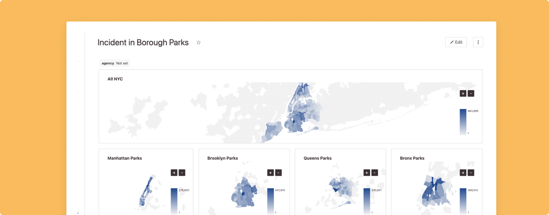
We’ve added a Map chart type, now in beta. Please ping us if you’d like to join the beta.
New sidebar
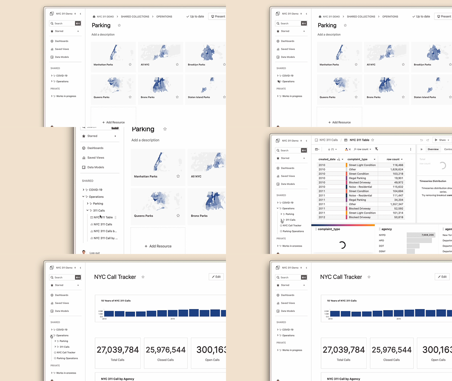
We put your collections right in the sidebar to make it easier to get to what you’re looking for and keep your project tidy.
You can now reorganize your content and make private resources shared right from the sidebar.
Rename Attributes
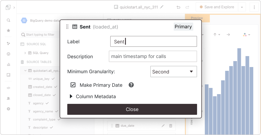
You can relabel any attribute to help your team understand a column's meaning and how it can be used.
Search Improvements!
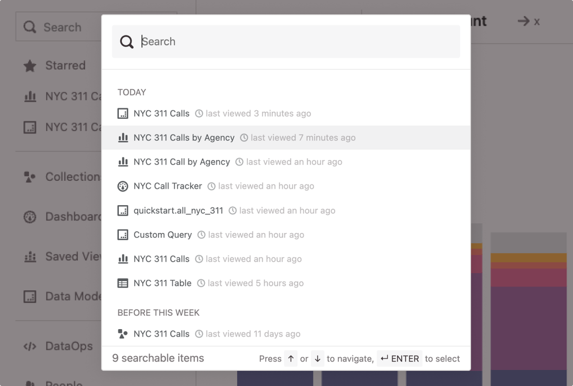
Get back to your most recent items quickly. The search palette starts with the last content you accessed and sorts results by most recently viewed.
SSH Tunneling
Hashboard now supports SSH tunneling for more secure connections. You can use a bastion host in your private cloud to allow Hashboard to more securely connect to your database.
